Table of Contents
Working with Explores - Reckon Insights Creator
Working with Explores
Explores are the heart of Reckon Insights, as they are the starting-points for exploring your data. Each Explore encapsulates a set (or data-centric viewpoint) of data (or measures), as well as tools (dimensions, filters, Visualisations) with which to select, sort, and display, this data.
We have had a very brief glance at the topic of Explores, with the article section Working with Dashboards - Adding content. This is a more detailed, though gentle, introduction to Explores which will introduce dimensions, measures, sorting, filters, and visualisations, by guiding you through the creation of a saved Visualisation.
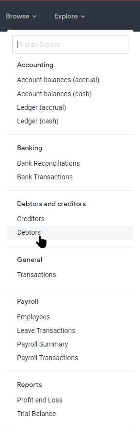
Explores can be found directly under the Explore menu. Type in the search text-box at the top of the menu to find an Explore. Reckon Insights has a variety of pre-built Explores, grouped by subject-area. In the image below the Explore Debtors is being selected from the Explore menu by clicking Explore -> Debtors.
Navigating and using the Field-picker
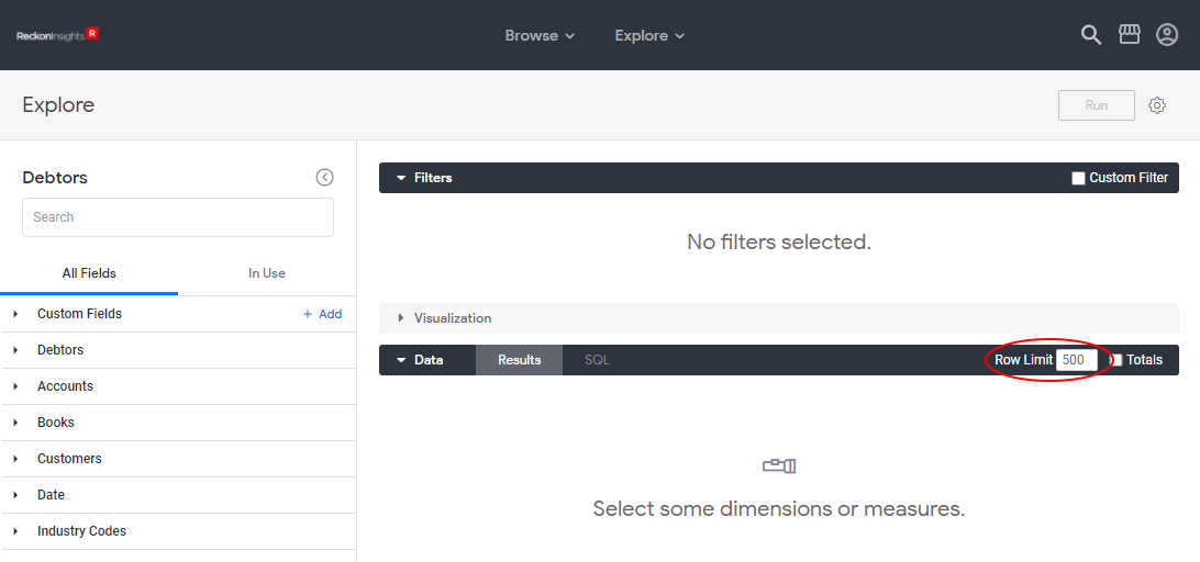
In the image below the Debtors Explore has just been opened. The data displayed by an Explore is determined by the dimensions, measures, and filters, selected from the Field-picker at the left. When an Explore first opens, there is no data displayed, as there are no dimensions or measures selected. There are no Filters selected either, but these act to limit returned data. The only specification made on a newly opened Explore is the Row Limit of 500 rows in the Data section header, which limits the amount of returned data, a good idea when developing Visualisations.
The field-picker is used to navigate to the dimensions and measures we want to display or incorporate into a Visualisation. At the top is the name of the Explore, with a search-box beneath. Use this to search for fields. Beneath the search-box there are two tabs. The All Fields tab where all the dimensions and measures are to be found, and the In Use tab, which displays only the fields in use on this explore. Unused fields cannot be found on this tab.
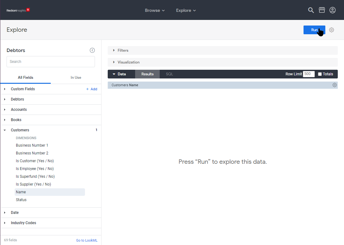
To navigate through the All Fields tab of the Field-Picker, click the triangles by each section-header to expand that section (click again to collapse it). Below is an image of the Field-picker with the Debtors section expanded, showing the types of fields available in the Field-picker.
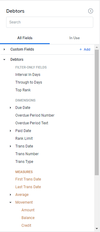
Field types in the Field-picker
These are the main types of fields available for selection on the All Fields tab of the Field-picker:
- Custom Fields: Custom fields will be discussed in the article Advanced Working with Explores
- Filter-only fields: These fields can only be used in the filters section of the Explore, where they work to reduce and refine the data returned by the query. More on Filters below.
- Dimensions: Dimensions can be thought of as a functioning like a cross between a bucket and a fine-toothed comb, depending on their granularity. A way of grouping data together and chunking-up (e.g. Customers Status), or a way of teasing it apart and focussing down (e.g. Customers Name), as well as having data-points themselves. They appear as orange columns in the Data section.
- Measures: Measures are our data-points of interest. They appear as blue columns in the Data section.
Adding data
Once data has been added, by selecting either a dimension or a measure, the Explore becomes a query that can be run. A message to this effect appears in the Data section, and the Run button at the top-right is enabled.
Adding a Dimension
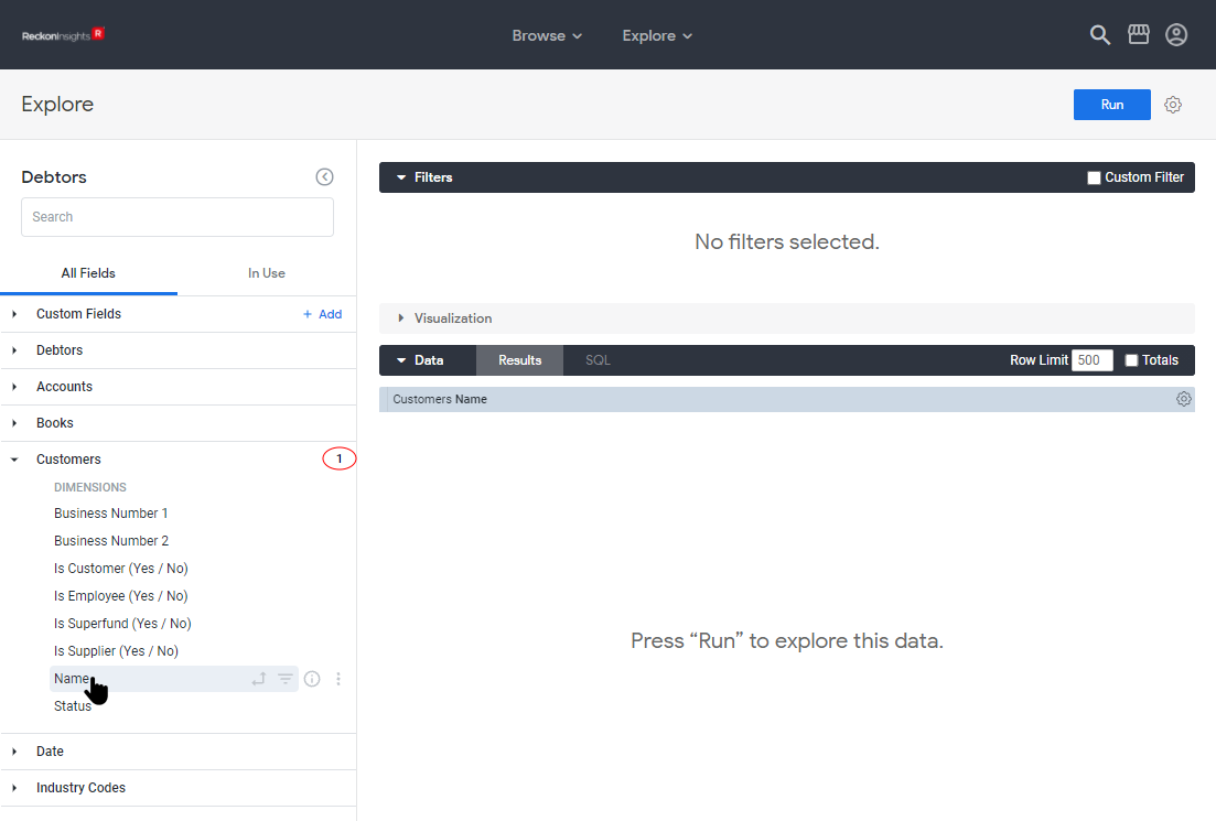
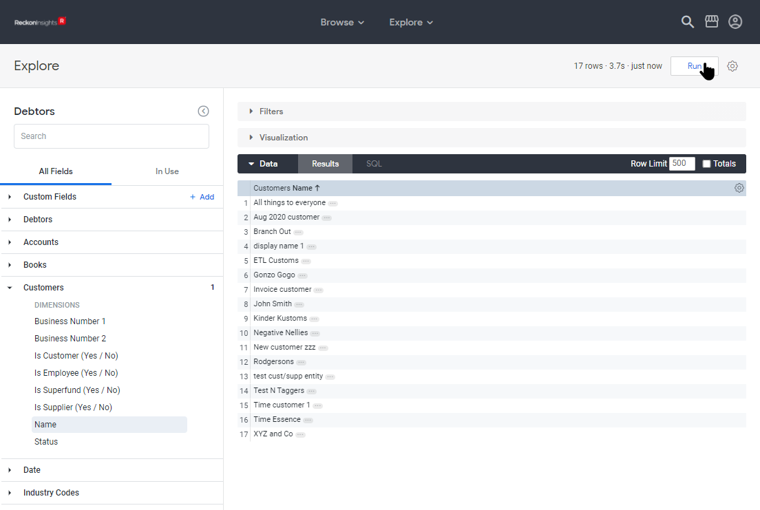
In the image below the dimension Customers Name has been selected by clicking the triangle to expand the Customers section, then clicking on the dimension Name.
Clicking on the Run button will run the query. In the image below, the Filters section has been collapsed by clicking on the triangle by Filters, clicking on the triangle again will re-expand it.
The query will display any data there is to return in the Data section. In this case, just the values of the dimension, which is granular down to the individual level. There are only 17 rows of data returned in this example, but had more data been accessible, the row limit would have stopped returning data at 500 rows.
Adding a Measure
We can also add a measure, in this case Debtors Balance. In the Field-picker, expand the Debtors area by clicking the triangle by the word, then under Measures expand the Movement section by clicking the triangle by the word, and finally click on Balance. This adds the measure Balance to the Data section of the Explore.
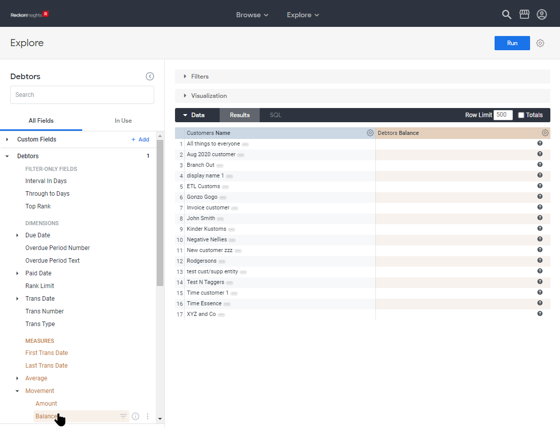
Please notice the following about the above image:
- The numeral 1 appears to the right of the Debtors section-heading in the Field-picker, showing that one field from this section is in use.
- The column in the Data section for the measure just added is orange, while the column for the dimension first added is blue. This is true for all measures and dimensions.
- There is data for Customers Name in the Data section, as we ran the query after adding that dimension, but there is no data for the measure just added. The query has been changed by adding the measure Debtors Balance, and needs to be re-run to populate the new column.
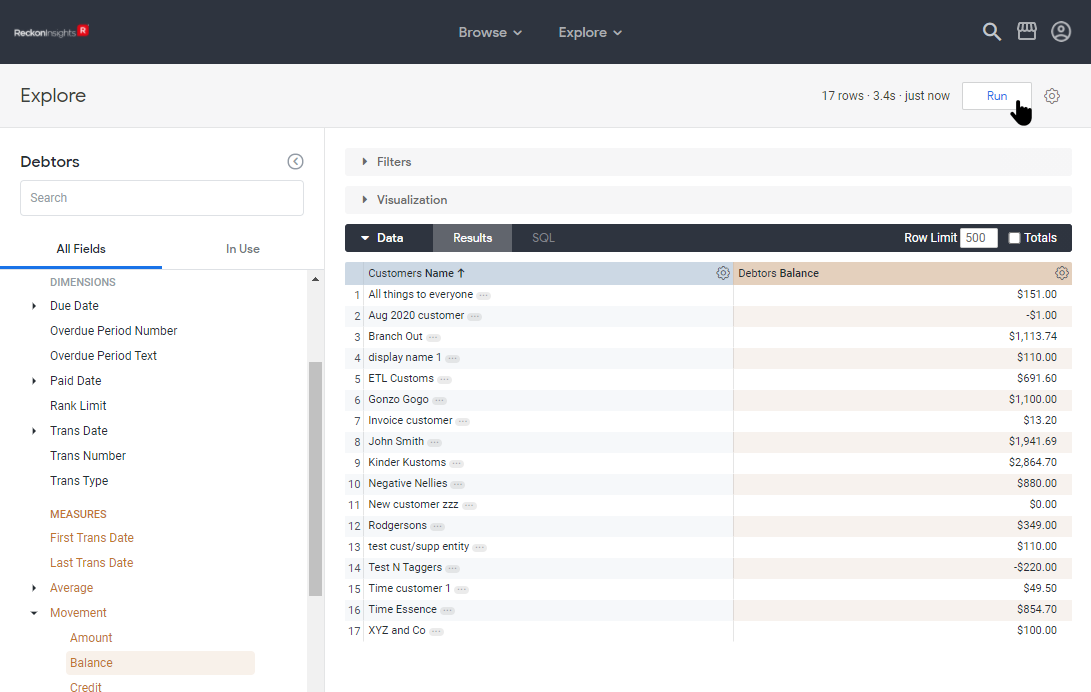
Click the Run button again to run the new query and populate the new column.
Sorting data
Data is always sorted, even if no sort order has been specifically set.
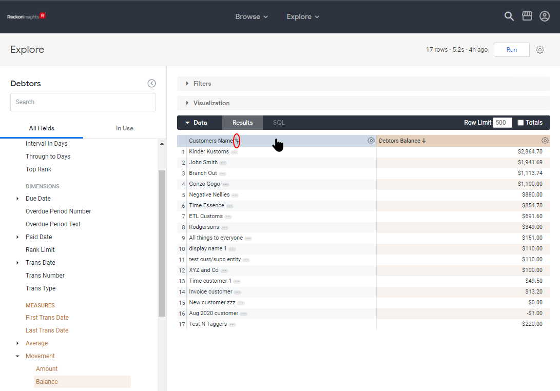
Default sort order
In the image above, again notice the arrow by the Data section column-heading Customers Name, showing this data is being sorted by this column, ascending. Data is sorted by default according to the following rules:
- The first date dimension, descending
- If no date dimension exists, the first measure, descending
- If no measure exists, the first added dimension, ascending
So, using these rules, we see the reason for the sort order in the image above is historical; the dimension Customers Name was the only field when the query was first run, so by the rules above ascending order was applied, and this sort order has persisted. If the query had been built differently, there would be a different sort order.
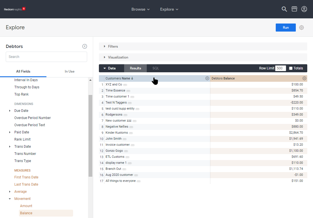
We see this with the image below. The difference between the image above and the image below is that in the image below, from a freshly opened Debtors Explore, both the fields were added before the query was run. With that information, we see the sorting in the image below follows the same rules.
Setting a sort order
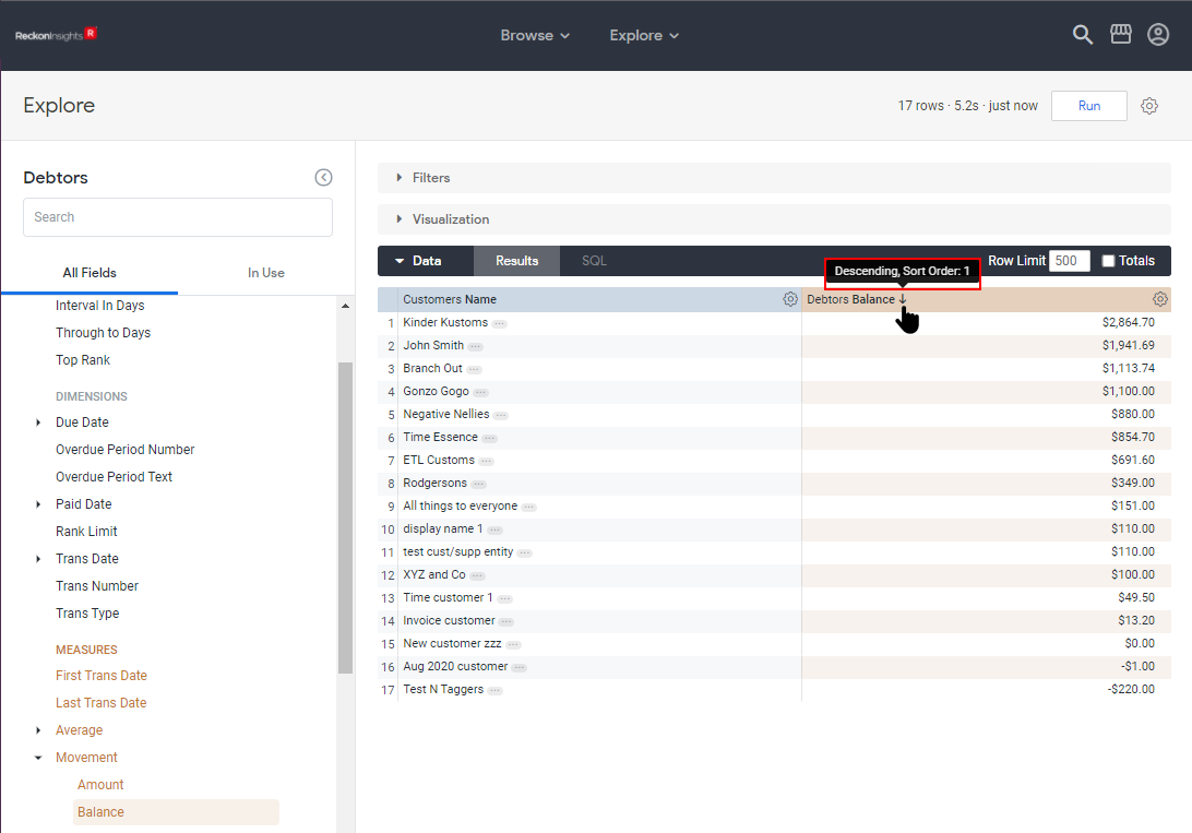
The current sort order of the query results seems relatively obvious, being indicated by the arrow in the column-header being sorted upon. What may not be quite so obvious is how to set the sort order. Upon hovering over a column-header that is not currently being sorted upon, a double-arrow icon appears in the column-header beside the name.
Clicking in the column-header now will make this the field by which the data is sorted. The sort order will toggle between ascending and descending each time the sorted column-header is clicked.
Sorting by multiple columns
To sort by more than one column, hold down the Shift-key and click on the column-headers in the order they are to be sorted. There is a hint to this effect displayed when hovering directly over the double-arrow sorting icon.
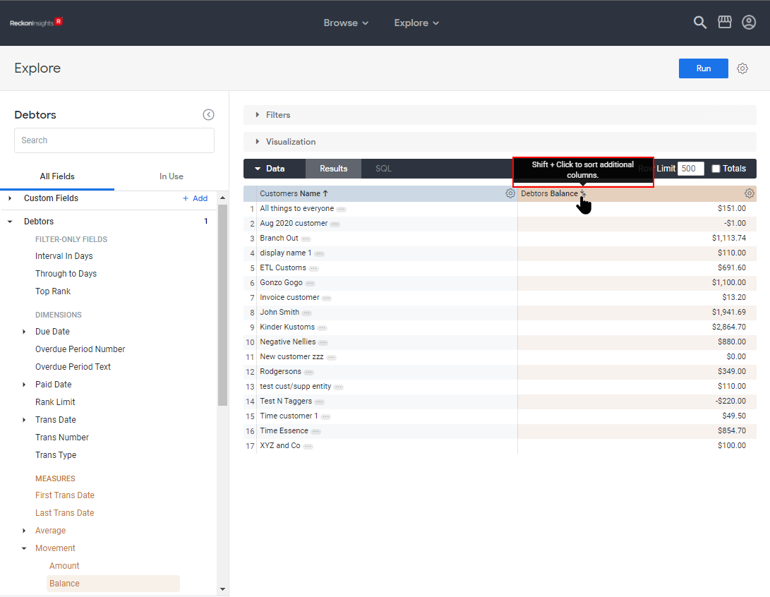
Shift-clicking on the double-arrow sorting icon now will assign this column as the second field to sort by, which is indicated by the numbers that now show next to the sort arrows.

Shift-clicking in the column-header Debtors Balance again will toggle the second sort-field to ascending. Once there are multiple sort-fields, they are toggled between ascending and descending by shift-clicking the column-header. Clicking on a column-header now sets that field as the sole sort-field.
More columns can be added to the sort order by shift-clicking, and each column can be toggled between ascending and descending by shift-clicking, but the sort order cannot be rearranged. The sort order can only be reset by clicking on a column-header to make it the primary sort field.
Adding another Dimension
You can add more dimensions to display more detail about your data. Simply click a dimension field to add it to the query. Here we are clicking on Debtors Overdue Period Text to add it.
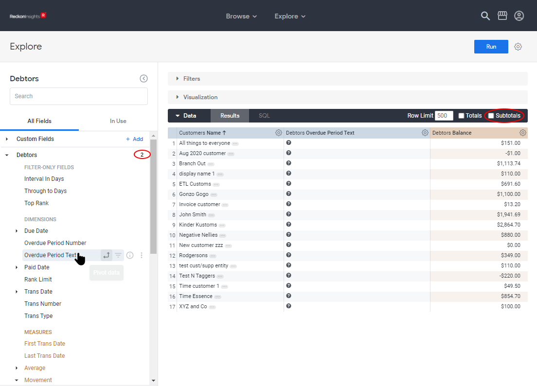
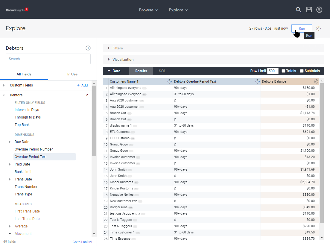
With the sort order set to Customer Name ascending, click Run to re-run the query and update the newly added field. Note in the image below there are multiple rows returned for each client, one for each value of Debtors Overdue Period Text. This is made obvious because the data is being sorted by Customer Name, and indicates we could pivot the data on Debtors Overdue Period Text to better display the information.
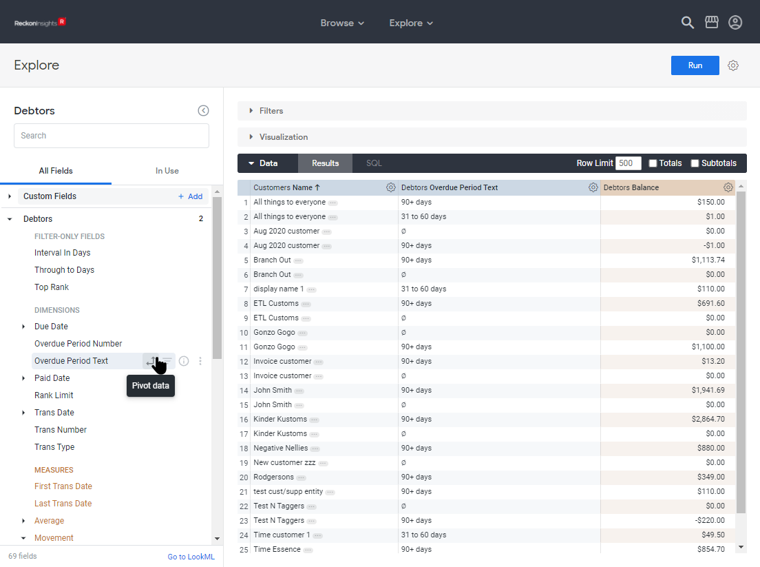
Adding a Pivot
To pivot on the dimension, hover the pointer over the dimension name Debtors Overdue Period Text in the Field-picker so the icons for the dimension are displayed, and click on the pivot icon, which is the leftmost of the four. The rest of the icons will be discussed in the article Advanced Working with Explores.
Again we have changed the query, and need to run it to see the new results.
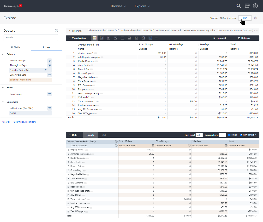
The data is now presented is a more understandable fashion.
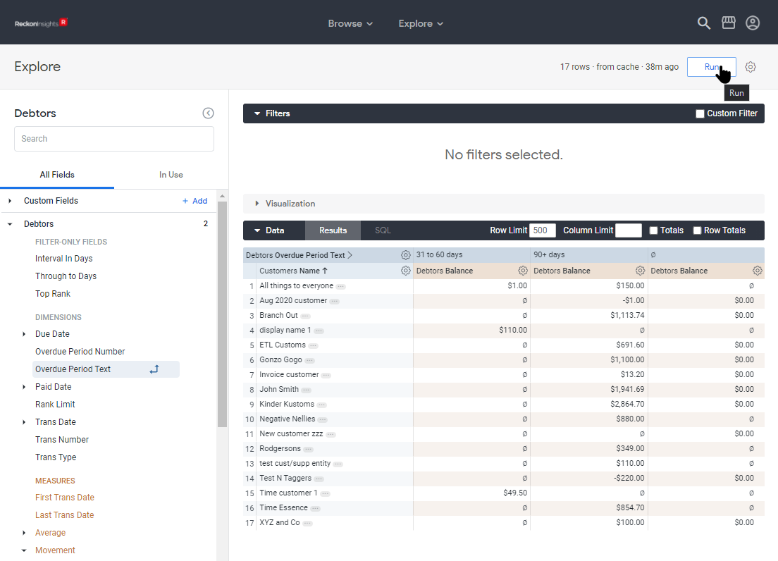
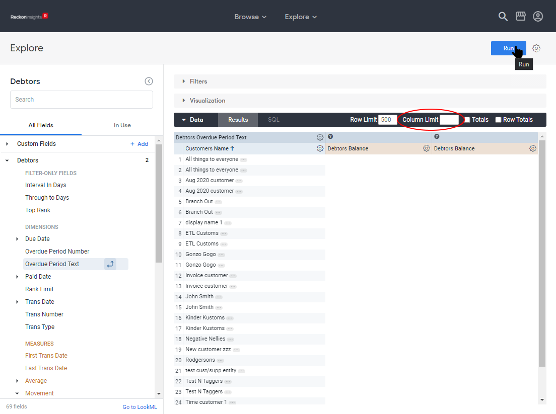
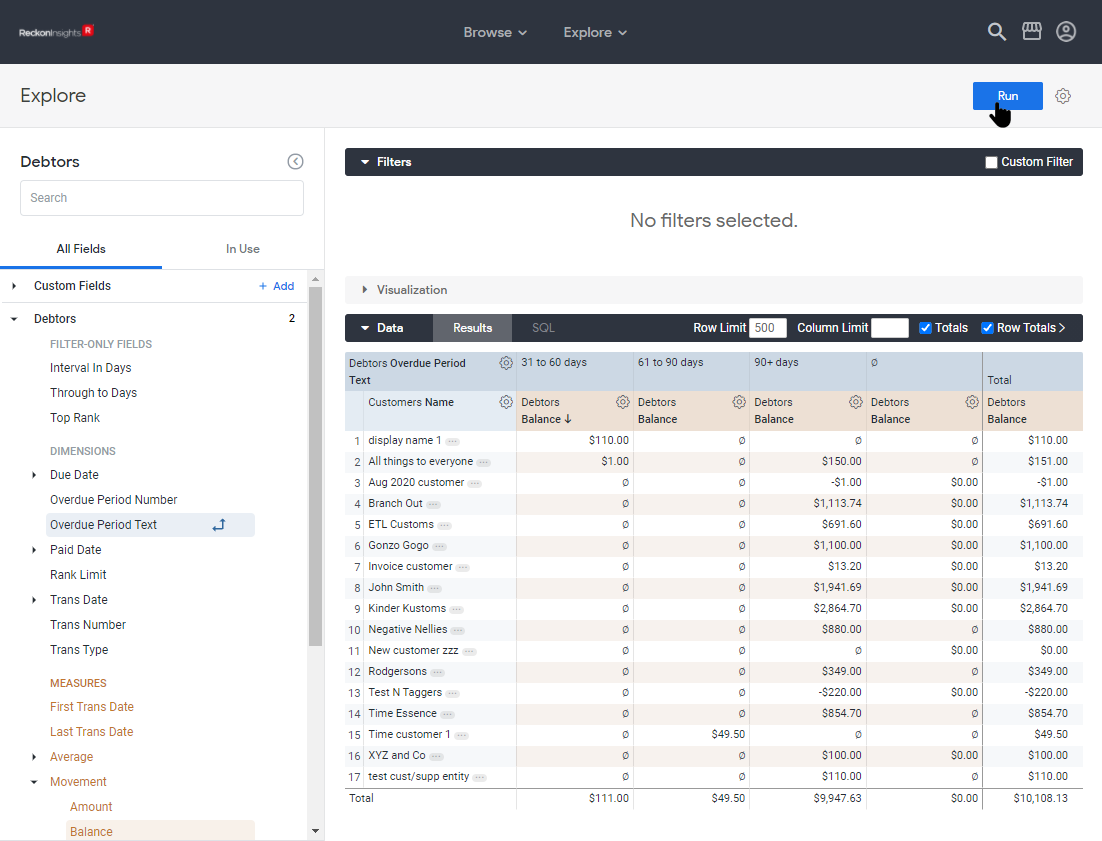
Adding Column and Row Totals
As well as column totals, once there is a pivot, row totals also can be added to the returned data, by ticking the check-boxes Totals and Row Totals respectively, at the right-most of the Data section-header.
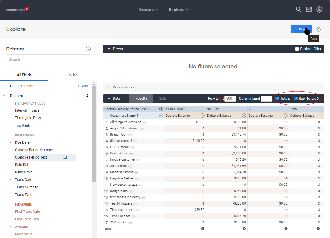
Again, they are blank until the new query has been run.
Adding Filters
The data returned by a query can be restricted to items of interest by adding filters. For example, results might be limited to certain dates, customers, or anything that is part of your data. Any field can be used as a filter, and a dimension or measure doesn’t need to be in the results in order to filter by it. For details on using filters, see Using Filters.
To add a field as a filter, in the Field-picker hover the pointer over the field, and click on the striped downward-pointing triangle.
If you are following along, add the following filters:
Add the field Debtors Interval In Days as a filter. Keep the default value of 30 days.
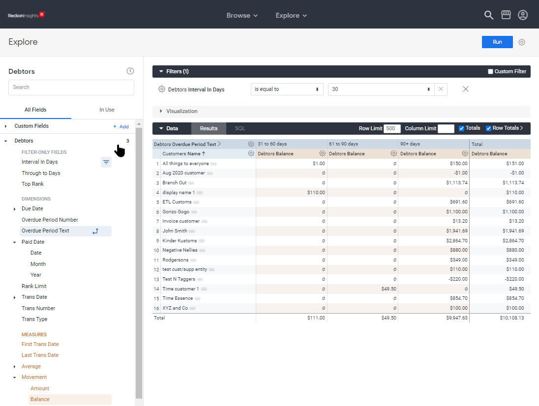
Add the field Debtors Through To Days as a filter. Keep the default value of 90 days.
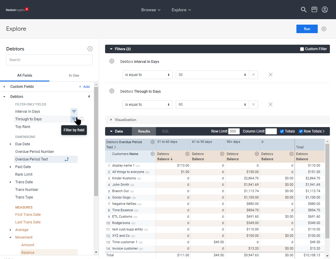
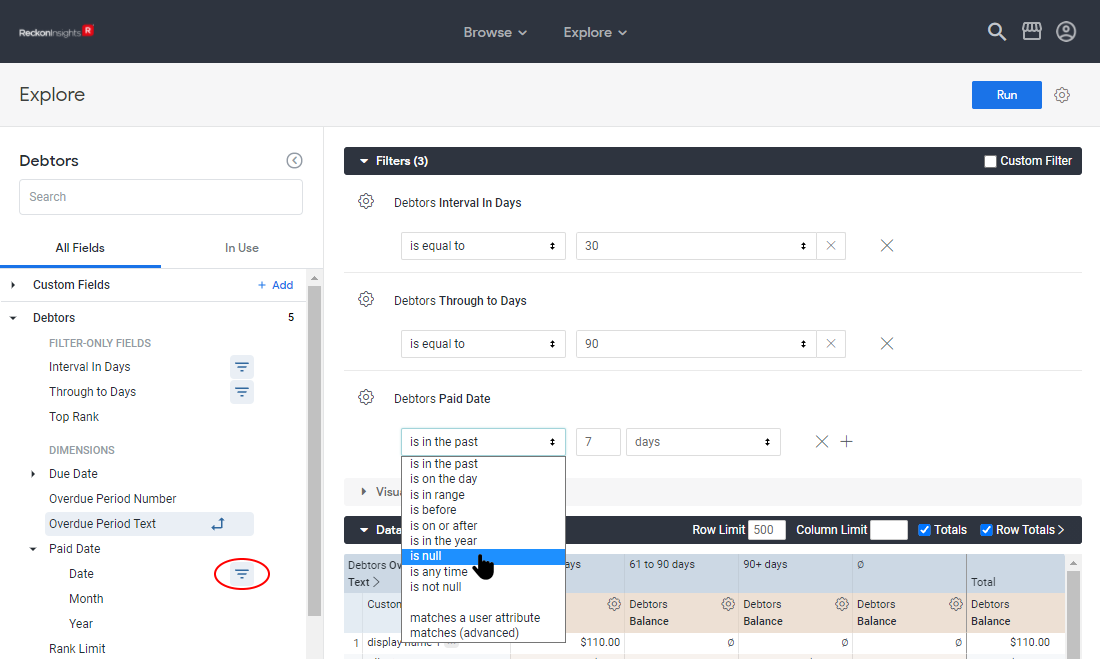
Next expand Debtors Paid Date by clicking the triangle, and then click the filter button by Date to add it as a filter. Then in the Filters section change the first drop-down for Debtors Paid Date to is null to filter for records without a paid date.
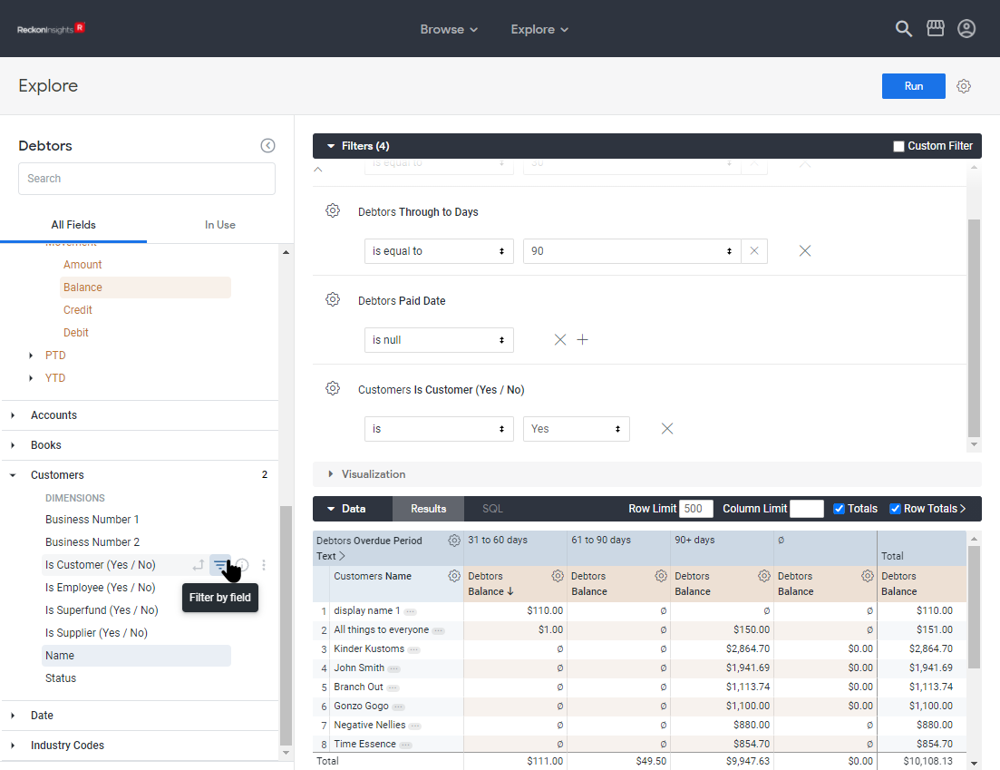
The next filter to add is the Customers field Is Customer. Scroll down in the Field-picker to find it, and click the filter button. This filter has the default values of is and Yes.
The final filter we are going to add in this exercise is the filter Books Book Name, which has no default value. As it has no default value, to use this filter we will have to supply a value. If no value is supplied, the filter is not used and the query returns data for all Books.
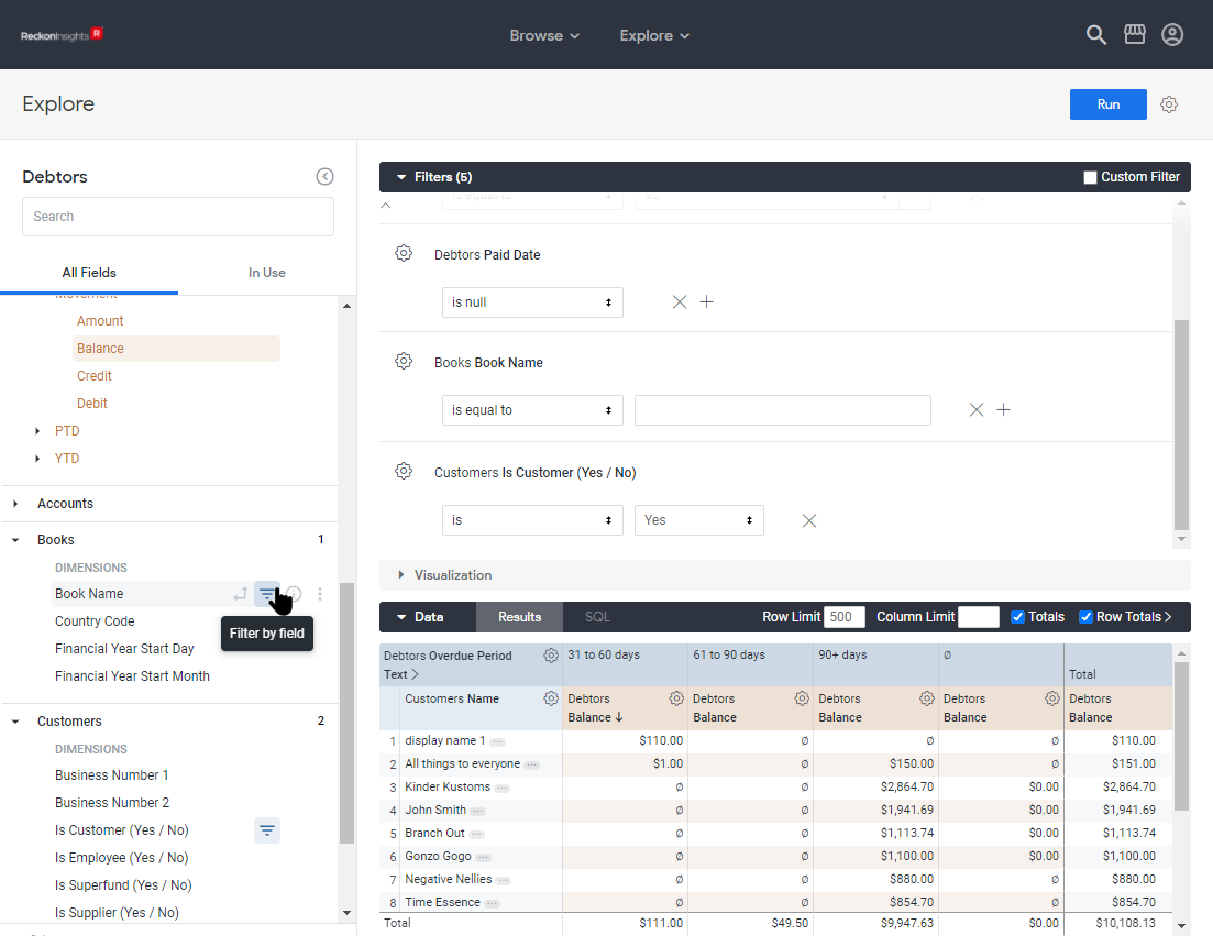
If you have been following along, you should now have an Explore that looks something like the following, with a total of eight fields in use, one from Books, two from Customers, and five from Debtors.
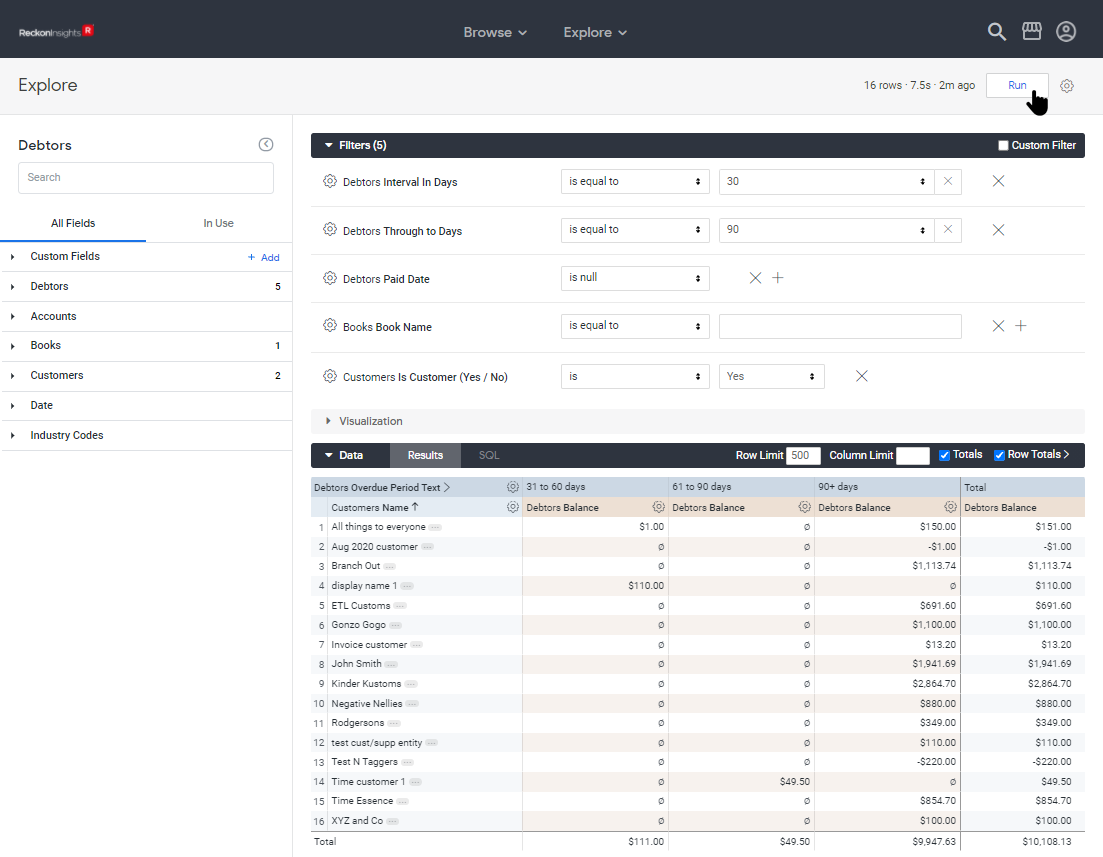
The only thing left to add now is a visualisation to display the information graphically.
Adding a Visualisation
Click on the triangle by Visualisation to expand the Visualisation section. Expanding the section displays in the header nine icons for types of visualisations, as well as the Ellipsis, Forecast, and Settings, menus. The Column chart is the default selection.
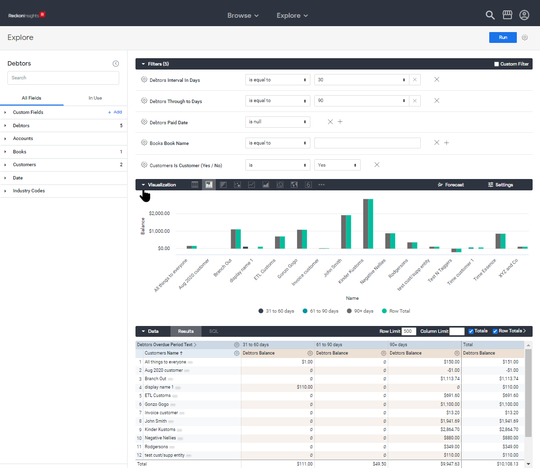
As well as the nine different visualisation-types displayed by the icons, there are over a dozen more visualisation-types available under the ellipsis menu to display data in interesting and imaginative ways. So with all that choice available, we are going to select arguably the most boring, the leftmost visualisation-type icon: Table. This displays a visualisation that looks very similar to the view in the Data section, but gives us the ability to format this table in some interesting ways. The other visualisation types will be discussed in the article Advanced Working with Explores.
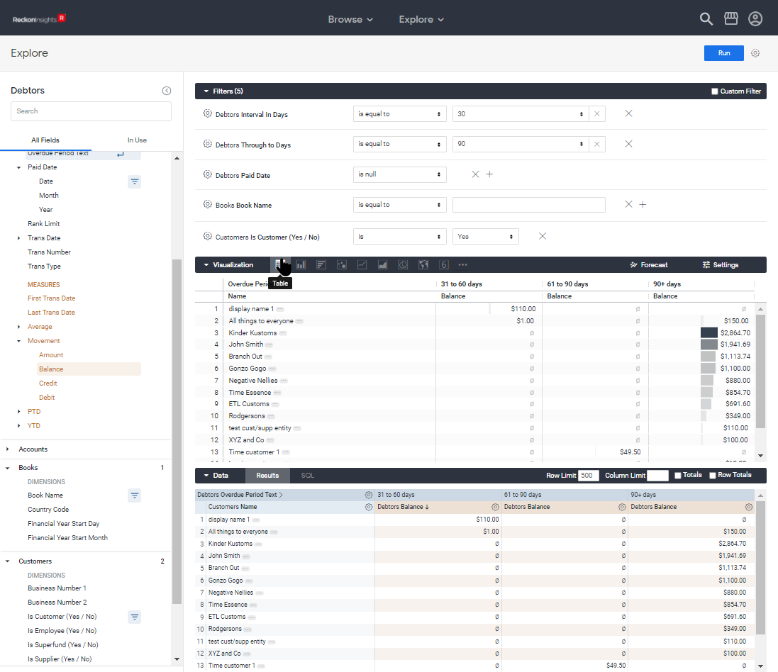
Just one more tweak, as the table is not quite boring enough, due to the interesting looking graphics in the 90+ Days Balance and Total Balance columns. These are controlled by a setting to be found in the Settings menu. This opens on the Plot tab, and the control for the graphic is on the Series tab. Click on the Series tab, then in the Customizations (sic) section, expand Debtors Balance, which is the column displaying the graphic. The control Cell Visualisation needs to be turned off.
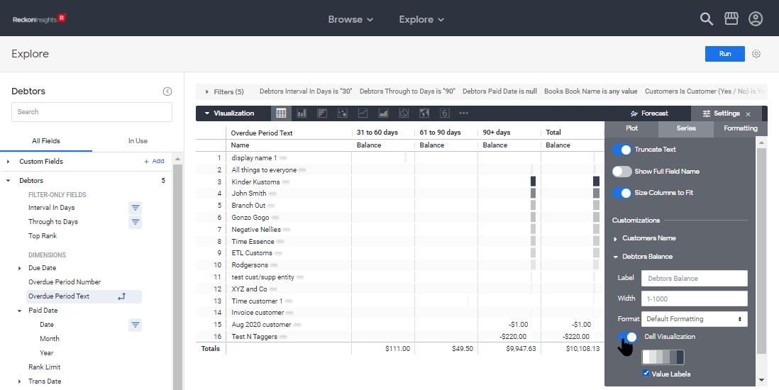
You can now close the settings menu. If you have been following along you should have something like the following, but with different data:
Saving
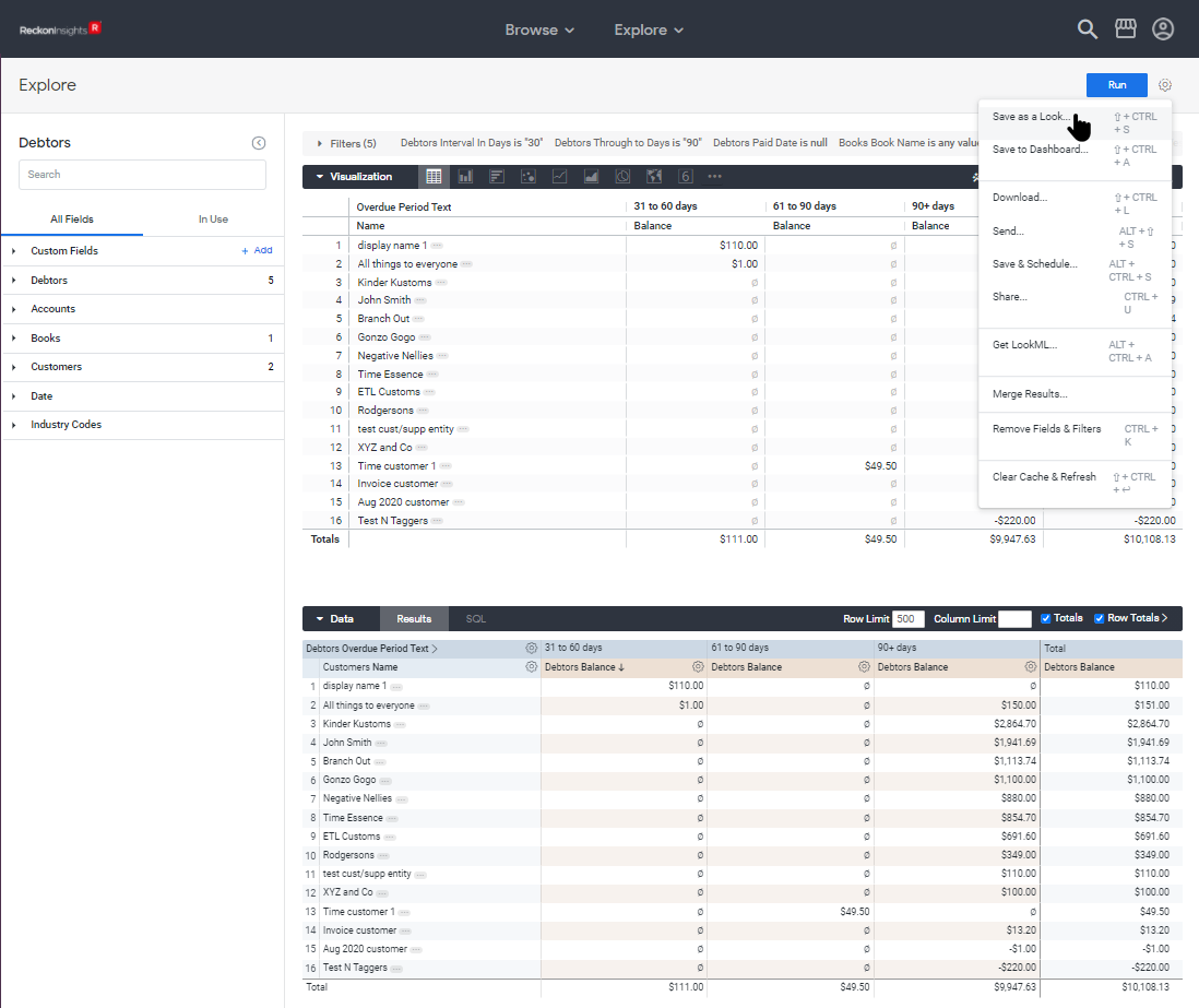
To save this Visualisation (or "Look"), click the cog menu at the top right, and select Save as a Look.
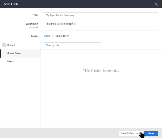
A dialog opens to select the folder in which to save the Visualisation. Your company folder can be found in the Shared folder, but in this example I am saving to my personal folder. As you can see from the name, what has been built is something rather similar to the Visualisation Insights -> Accounts Receivable -> Reports -> Aged Debtor Summary.
Adding to a Dashboard
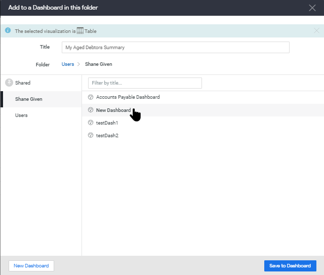
As well as saving in a folder, the Visualisation can be added to an existing Dashboard. Exactly similar to saving in a folder, click the cog menu, but this time, select Save to Dashboard.

Again a dialog opens, this time to select the Dashboard to which the visualisation will be added. Your company folder can be found in the Shared folder, but in this example I am saving to a Dashboard in my personal folder.
This completes the gentle introduction to Working with Explores.
For more detail on working with Explores, see the article Working with Explores - Continued.
Back to Table of Contents - Creator
Need more help?
Ask the Reckon Community at: https://community.reckon.com/
Or Log a Support Ticket: https://www.reckon.com/au/support/