Reckon Customer Portal
How to - Reckon Customer Portal
Getting Started
Changing from a Single Sign On (SSO) Login to Username/Password
Creating an Account
Updating your Details
FAQ - Customer Portal
Products
Partners
Troubleshooting - Reckon Customer Portal
Reckon One
How to - Reckon One
Getting Started - Reckon One
Day to Day
Recurring Transactions
Estimates
Invoices - Reckon One
Customer Adjustment Notes
Receive Money
Bills - Reckon One
Supplier Adjustment Notes
Make Payments
Chart of Accounts
Projects
Items
Timesheets
Expense Claims
Journals
Customer Statements - Reckon One
Contacts centre
Reckon One: Contacts
Payroll
Upgrading to the new experience
FAQ's - upgrading to new Reckon Payroll experience
Viewing YTD values in the new experience
Accessing and upgrading to Reckon Payroll from Reckon One
There is an issue with your account! - Error when accessing Reckon Payroll
Quick Guide
Pay Items
Employees
Employee invitation
Processing a Pay Run
Processing SuperStream in Reckon One and Reckon Payroll
Super Funds
Single Touch Payroll - Reckon One
Processing EOFY - Reckon One
Payment Summaries
Processing Payments
Using Reckon One Timesheets with Payroll
Lodge Tax File Number (TFN) Declaration
FAQ - Reckon One STP
Banking
What's New in Banking
Bank Accounts - Reckon One
Bank Transactions
Suggested Matches
Allocate Transactions
Reckon One Transactions
Fast Coding
Reconciliation - Reckon One
Reconciling your accounts
Undoing a bank reconciliation
Transfer Money
Transaction Rules
Bank Payments
Reporting
Features
Document Storage
Reckon One Search
Grossed-Up Transactions
Classifications
Column Filters
Import Chart of Accounts
Book Settings
Day to Day Settings
Template Settings
Money in Settings
Money out Settings
Time settings
Reckon One: Statements Settings
Employee expenses Settings
General Settings
Payroll Settings
Tax Settings
Reckon One: Contact Detail types
Integrations
Payment Services
Zapier
Zapier
Zapier and Shopify
Zapier - create an invoice or receipt
Zapier Action - Create an invoice in Reckon One
Reckon Ecommerce
Dashboard
User Guides - Reckon One
Support
Reckon One FAQ
Reconciling External Merchant Fees
Troubleshooting - Reckon One
Reckon One UK troubleshooting
How to unlock the bank account that has been locked after reconciliation.
Processing Time In Lieu in Reckon One
Error – the value ‘/Date(14749879800000)/’ is not valid for StartDate
Preparing Reckon One for Single Touch Payroll, (STP)
Postings don’t balance when entering a Journal.
Error: Line item does not have a number, when entering TimeSheet entries on an Invoice
Recording RCTI in Reckon One or (buyer created tax invoice)
‘Pay run error: the number credit is outside the valid range’ when finishing the termination payrun.
How to update YTD balances on the Payment summary in Reckon One
Can’t add a tax code to a transaction in the Payments and Receipts window of CashBook.
STP Screen has Doubled Up Employees & Gross Amounts in Reckon One
Invoice shows Due Date one day before Invoice Date
Delete the bank transactions (QIF/CSV file) in bulk that was incorrectly imported.
Creating customer statements
Writing Off Bad-Debts in Reckon One:
How to enable/process Taxable Payments Annual Reports (TPAR) in Reckon One.
Text on Reckon One new design is not properly aligned
Access Denied or You do not have enough access rights ... attempting to view a Book on Mobile App
Credit Card transactions no longer available in Reckon One after creating a new Yodlee feed
Recording SuperStream payments in Reckon One
BankData signup & configuration for Reckon One
Invoices print with part of top and left side cut off
Create new user in Reckon One, Delete the user, share the book with accountants
“Invalid Company Information error” in GovConnect STP when submitting pays from Reckon One
Manually Importing PayPal fee transactions.
How to link Bankdata feeds and allocate transactions in Reckon One
"An error occurred while processing your request or the page you last visited does not exist anymore" when create/view a TPAR report
Transaction rule does not pick up the transaction
How do I enable Leave Loading to be included in Super calculations in Reckon One?
Downloaded Bankdata transactions disappear from a Reckon One Book
Setting up and processing Payroll in Reckon One.
Configuring and Understanding PayPal integration in Reckon One
Enter opening balances in Reckon One
How to update the billing information in Reckon One? How to change the credit card details
Cannot process a downloaded Bank Transaction - <> characters in the Description field.
How to add or change or purchase the new modules? Activate /Deactivate Modules
How to Setup and Calculate Super in Reckon One
Downloaded bank transaction does not allocate to bank ledger accounts
No ability to unlink a bank ledger account from a bank feed
How to purchase the expired trial book?
“Error reading selected bank transactions” when clicking on Reconcile on the Banking Screen
Processing GST payable and GST refunds to and from the ATO in Reckon One
Last financial year to date report does not show transactions to today
Error: The journal does not balance when marking pay run as Paid
Latest Bankdata transactions not available in Reckon One Book.
How to enable Estimates or Quotes feature in my Book?
Editing and creating a new ABA file with an updated amount
Portal: Unable to modify user because R1 Request Failed
Entering Gross Amounts (Tax inclusive) or Net Amounts (Tax exclusive) in your transactions.
Why do I get an Error 522 when I attempt to add my bank account to my BankData record through Yodlee
How to edit/delete the paid invoices in Reckon One?
Submitting an STP Update Event or Full File Replacement in Reckon One
Setting up a BankData account on Reckon One
Payable Type field in Reckon One
Unable to login to Reckon One Portal when Ad-blocker is installed.
Looping issue when creating new Book.
How to Submit a Nil STP Submission to the ATO using Reckon One
Grey Screen When Trying to Print in Reckon One
How to process the Termination in Reckon One?
How to enter a Director’s Loan into a Reckon One Book
Credit for GST tax paid on BAS does not match GST on Purchases on GST Summery Report
How to lock or unlock the book.
Processing SuperStream in Reckon One
Manually Importing PayPal transactions
Deleting a Reckon One BankData subscription
An error occurred submitting single touch payroll details to the API
Super is not calculating
Entering the FBT amount on the Payment Summary in Reckon One
Error - Tax code cant be entered for non-taxable items
The opening balance changes in a reconciliation when a transaction from previous month, is reconcile
Creating an ABA file for batch payments processing in bank, from Reckon One.
How do I enter ACN in Reckon One?
SSO (Google/Microsoft) accounts are unable to login from Mobile App.
Supplier Overpayment
Duplicate Pay Runs Automatically Created in Reckon One
Understanding RESC in Reckon One
Receiving a cash refund for an overpayment of a bill.
Refund customer overpayment
Connecting your Book to your BankData feeds
Forcing an immediate update of your Yodlee bankfeed
STP Payrun Has No Figures Appearing
Removing an account from your Reckon One BankData Record
Importing PayPal transactions and matching with my records from PayPal payment services.
How to switch the ownership of a bank feed
How to close a BankData Account in Reckon One
Entering YTD Payroll balances in Reckon One, when migrating from another software.
Creating a new role for a user in Reckon One.
Reckon Payroll
Reckon Payroll - App
How to - Reckon Payroll App
Single Touch Payroll Phase 2 - Reckon Payroll App
How to prepare for Single Touch Payroll Phase 2 - mobile app
Preparing Employees for Single Touch Payroll Phase 2 - mobile app
Prepare Earnings for Single Touch Payroll Phase 2 - mobile app
Preparing Allowances for Single Touch Payroll Phase 2 - mobile app
Preparing Leave for Single Touch Payroll Phase 2 - mobile app
Other leave Single Touch Payroll Phase 2 - mobile app
Switch to STP Phase 2 - mobile app
Reckon Payroll | STP Phase 2 Checklist | Phone Browser
Getting Started - Payroll App
JobKeeper Items - Payroll App
Adding Employees - Payroll App
Creating a Pay Run - Payroll App
Reports - Payroll App
Settings - Payroll App
Invite employees to Reckon Mate from the Reckon Payroll mobile app
End of financial year report - Payroll App
Revoke employee access to Reckon Mate from Reckon Payroll mobile application
Migration to Reckon Payroll app
Reckon Payroll: Set up Pay Schedules on the Payroll app
Manage Company bank details
Manage pay schedules
Manage superannuation funds
Manage Earning items
Manage Leave items
Manage Allowance items
Manage Deduction items
Manage Reimbursement items
Manage Superannuation items
Maintain employees pay schedule
Maintain employee bank accounts
Maintain employees superannuation
Maintain employee pay setup
Reckon Payroll App: Pay an employee reimbursement
Terminate an employee and complete final pay
Pay an employee Back Payments, Commissions, Bonuses and similar payments
Pay an employee return to work payments
Use tax table for daily and casual workers
Reckon Payroll: Pay unused leave on employee termination using Schedule 7 – Tax table for unused leave payments on termination of employment
Troubleshooting - Reckon Payroll App
Reckon Payroll - Web
How to - Reckon Payroll Web
Single Touch payroll Phase 2 - Reckon Payroll Web
How to prepare for Single Touch Payroll Phase 2 - Reckon Web
Preparing Employees for Single Touch Payroll Phase 2 - Payroll Web
Preparing Earnings for Single Touch Payroll Phase 2 - Payroll Web
Preparing Allowances for Single Touch Payroll Phase 2 - Payroll Web
Preparing Leave for Single Touch Payroll Phase 2 - Payroll Web
Preparing Other Leave for Single Touch Payroll Phase 2 - Payroll Web
Additional STP Phase 2 checks
Pay runs
Calculating tax for daily and casual workers
Paying a Company Contribution
Paying a Reimbursement - Reckon Payroll
Entering back payments, commissions, bonuses and similar payments
Processing a termination pay
Employees
Invite employees to Reckon Mate from Reckon Payroll web
Adding a Company Contribution to an Employee
Rehire an employee in Reckon Payroll
Assigning YTD values to employees
Compliance
Settings
Settings overview - Reckon Payroll (Web)
Creating an employee super fund in Reckon Payroll Web
Set up pay schedules on the Payroll App (web access)
Creating a custom super item in Reckon Payroll Web
Managing Pay items for Back Payments, Commissions, Bonuses and similar payments
Managing Company Contributions
Manage Leave Balance for Pay Slips in Reckon Payroll
Managing Reimbursements
Getting Started - Reckon Payroll for Web
How to include time worked leave accruals in pay items - Reckon Payroll
Troubleshooting - Reckon Payroll Web
Reckon Invoices
Reckon Invoices App
How to - Reckon Invoices app
Getting started - Reckon Invoices app
Creating a customer & contact - Reckon Invoices App
Creating an invoice - Reckon Invoices App
Approving an invoice - Reckon Invoices App
Sending invoice - Reckon Invoices App
Delete account - Reckon Invoice App
Release Notes - Reckon Invoices app
Reckon Accounts
How to - Reckon Accounts
Reckon Accounts - Payroll
Reckon Accounts - Single Touch Payroll (AU)
Reckon Accounts - STP Phase 2
Reckon Accounts - STP Phase 2 Requirements
Reckon Account - STP Phase 2 - Tax Treatment Code
STP Phase 2 - Tax Treatment Code in Reckon Accounts 2023
STP Phase 2 - Income Type in Reckon Accounts 2023
STP Phase 2 - STP Tax Category in Reckon Accounts 2023
STP Phase 2 - Medicare Levy Surcharge in Reckon Accounts 2023
STP Phase 2 - Medicare Levy Reduction (No. of Dependants) in Reckon Accounts 2023
STP Phase 2 - How Tax Treatment Code is designated in Reckon Accounts 2023
ATO Tax Treatment Code Matrix in relation to Reckon Accounts 2023
Reckon Account - STP Phase 2 - Disaggregation of Gross
STP Phase 2 - Disaggregation of Gross
STP Phase 2 - Tax Tracking Type changes in Reckon Accounts
Permissible Income Tax Tracking Types per Income Type
STP Phase 2 - Payment type codes in Reckon Accounts
STP Phase 2 - Employment Basis in Reckon Accounts 2023
STP Phase 2 - Cessation Type in Reckon Accounts 2023
Reckon Accounts - STP Phase 2 Migration Assistant Pages
Reckon Account - Prepare Employee Details
Prepare Employee Details: Available options
Prepare Employee Details: Permitted and available fields
Prepare Employee Details: Validations based on selections
Migration Assistant: Welcome/Resume Page
Migration Assistant: Prepare Employee Details
Migration Assistant: Prepare Gross Wages Items
Migration Assistant: Prepare Allowance Items
Migration Assistant: Prepare Leave Items
Migration Assistant: Completion page
Overview of the STP Phase 2 for Reckon Accounts
STP Phase 2 - Employer Checklist of key changes
STP Phase 2 - Company changes in Reckon Accounts
STP Phase 2 - Employee detail changes in Reckon Accounts
STP Phase 2 - IIF changes for Export/Import
STP Phase 2 - Frequently Asked Questions (FAQ)
STP Phase 2 Migration Assistant
STP Phase 2 changes in Reckon GovConnect
STP Phase 2 - Known Lodgement error messages from Reckon GovConnect using Reckon Accounts
Year-end finalisation (EOFY) in Reckon Accounts 2023
Account Numbers are disabled after launching the Migration Assistant in Reckon Accounts 2023
Handling All purpose allowances with Overtime in Reckon Accounts 2023
STP Phase 1
Single Touch Payroll - Reckon Accounts
Preparing your Company File - Reckon Accounts
Final Pay Event
Transmitting Data to GovConnect
Pay Event
Pay Event Types
Update Event
Full File Replacement
EOFY Finalisation (STP Phase 1 - 2018) - Reckon Accounts
FBT Reporting
BAS Prefill - Reckon Accounts
FAQ - Reckon Accounts STP
BAS W1 Prefill on the ATO Business Portal displays the incorrect balance of Total Gross with Salary Sacrifice
Employees
Reckon Accounts - Multiple Tax Table Support
JobKeeper Payment
Adding JobKeeper Allowance pay items in Reckon Accounts
Processing Jobkeeper payments in Reckon Accounts
JobMaker Credits
Reckon Accounts - Legislative Changes
Reckon Account - 2023
QLD Mental health levy update for 2023
Handling Paid Family and Domestic Violence Leave (PFDVL) in Reckon Accounts
Reckon Account - 2022
NSW State Payroll Tax Rate update for 2022
Important changes to Super Guarantee for employees under 18
Reckon Account - 2020
Payday filing (NZ)
Payday filing (NZ)
Employment Information (EI)
Preparing your Company File - Reckon Accounts Payroll
Advance Holiday Pay
QuickBooks Super Guarantee reporting feature
Handling Super Salary Sacrifice in QuickBooks QBi series
Setting up a non-super Salary Sacrifice item for a salary package
Tips for uploading tax reports to the NZ Internal Revenue Department
Reckon Accounts: FBT details do not print on BAS form
Reporting Super for Contractors
Creating a Leave Taken Report in RA Enterprise 20** and earlier
Setting up a non-super Salary Sacrifice item (Novated Lease/ Salary packaging)
Create Casual Loading Item
Installation/Activation Topics
Upgrading to QuickBooks 2002 Trial on a Windows Vista and later PC, as part of an upgrade process
Installing Quickbooks on a Small Business Server 2011
Reckon Accounts and Windows 10.
How to Activate Reckon Accounts Business / QuickBooks
Installing QBi on a Windows Server and Terminal Server – 2003 & 2008
Guides on installing Reckon Accounts Business in the Multi user environment
Company
Changing the title of Reports in Reckon Accounts
How do I add my company logo to sales and purchase order forms?
Secondary ID
Special Tags
Banking
Emailing and Reporting Topics
How do I see the WC code uncombined in reports?
How do I generate a report that displays the transaction details (splits) for a specific account?
Using Yahoo! Mail third-party App Passwords for Email Service Connection issues when emailing
How to continue using Gmail when Google 'Less secured app' is removed
Customers
How do I invoice a customer for a part or percentage of an estimate?
Links
Find an item by Barcode on Sales Receipts
Find an item by Barcode
Payment Receipt
Suppliers
Handling a refund from a supplier?
How to handle a Refund from a Supplier.
Taxable Payments Annual Report (TPAR) in Reckon Accounts
User Guides
Installation & Upgrade Guide
User Guide - RA Business
Payroll Guide - New Zealand
Blank Tax Detail reports
How to handle Bad Debts
Writing off a Bad Debt in Reckon Accounts
Configuring your Invoice template for OVERDUE stamp
How do I add a logo to my invoices?
How do I change the default bank account QuickBooks uses in Pay Bills?
Backing Up and Restoring Data Files.
How to make Time in Lieu appear on the payslip in Reckon Accounts Business.
How do I print reports across a single page?
How Do I Use Discount Line Items?
How do I enable Leave Loading/Holiday Loading to be included in Super calculations in Reckon Accounts?
How do I add a text box to my custom forms?
Configuring Reckon Accounts Business and Hosted for SuperStream
How to view the QBwin.log file
How do I set up an opening balance for an Accounts Payable or Accounts Receivable account?
How do I apply tax codes to items sold to foreign customers?
How do I use the Pro Timer?
How to enable Taxable Payments Annual Report, assign Suppliers to the Report and process the report
How do I print a disclaimer or other standard text on my invoice?
How do I change the Title or Headings of my invoice?
Using a Profit & Loss Budget in Reckon Accounts Business
How do I Turn Inventory Tracking on?
How to make and assign a refund cheque to an unused payment for a customer.
Reckon Accounts Desktop: How do I create items for inventory?
How do I handle customer overpayments?
How to submit the TPAR file to the ATO
Importing and Exporting Templates.
How do I print cheques in batches?
How to connect a RA company File to Bankdata feeds
How do I turn on inventory in Reckon Accounts?
How do the user permissions to create and print reports work?
How do I enter or change the opening balances for my customers?
How do I remove field borders on invoice template?
How to process PAYG Tax and Tax Payable on a single cheque in QuickBooks
How do I enter a refund or rebate to a customer?
How to re-import a bank statement file (*.qif)
How do I get my logo copied into a form that I exported to another company?
How do I pay my credit card bill?
How do I open a company file that is on another computer or on a file server?
How to close a BankData Account with Reckon Accounts Business and Reckon Accounts Hosted
How to Submit a Nil STP Submission to the ATO using Reckon Accounts Desktop/Hosted?
How to set up the Schedule Backup function in Reckon Accounts 2023?
Measuring network performance ( transfer speed in Mb/s )
How to track workcover in QuickBooks (versions 2003 and later)
How to recover a failed import of BankData on desktop RAB.
How to stop reducing SG from Salary Sacrifice (new law effective from 1 Jan 2020) in Reckon Accounts
How do I Print a single journal entry
How do I memorise a transaction in QuickBooks?
How do I show Inventory items on an Open Purchase Orders Report?
How to merge list items to correct minor file corruption in lists.
How do I set up budgets?
How do I terminate an employee with a lump sum payment?
How to make and assign a refund cheque to an unused payment for a customer.
How do I print invoices that are not the standard size?
How do I unpay a bill?
How to handle a Recipient Created Tax Invoice (RCTI) in Quickbooks
How do I receive and deposit a payment from a customer?
How do I apply an existing credit to an invoice?
How to turn UAC on or off on a Windows 7 or Vista PC
How to merge bank accounts
How do I start QuickBooks without loading a datafile?
How do I time an activity?
I have a supplier who is also a customer. How do I show the bill and invoice as being paid when I owe the supplier and the customer owes me?
How do I track reimbursable expenses?
How do I pay a bill in Accounts Payable (A/P) in Reckon Accounts?
How do I change the Date of a report from United States format?
How to memorise a report.
How to set the default email program to work with QuickBooks for emailing invoices.
How do the Desktop options of the Desktop View in Preferences function?
How to make sure that online backup is backing up properly.
How to turn on .Net Framework 3.5.1 in Windows 7
How to Remove Bulk Forms to be Emailed in Reckon Accounts
How to Create a printable bill credit advice with item display when requesting a refund from a Supplier
How to backup the Windows Registry
How do I memorise reports?
How do I print my payslips?
How to stop the Auto-fill transaction feature
How to omit Customer:Jobs from the Customer Contact List
Importing accountant's changes
How do I create a cash flow report?
How do I track Payroll Leave Liability on my Balance Sheet?
How to claim Fuel Tax Credit in Reckon Accounts Business
Wine Equalisation Tax configuration for Reckon
How to create the Paid Parental Leave payroll item in QuickBooks 2010/11
How do I change the currency symbol on printed forms?
How to Process RDO in Reckon Accounts Business?
How to enter the FBT onto an employee’s record for STP or Payment Summary
Reckon Accounts Desktop: How do I customise the fonts on my forms?
How to improve the performance of your Reckon Accounts company file
How do I get a tear along line above the remittance advice in an invoice
How do I enter credit card purchases?
How to handle an unpresented cheque
How do I handle returned items on an unpaid invoice?
How do I generate a report that shows my customer balances?
How to create a GST Ageing Summary Report
Turning on Safe Mode in Windows 10
Reckon Accounts: How to pay the Australian Taxation Office by Credit Card
How do I change the opening balance for an existing account?
Turning on the Windows Built-In Administrator account
How do I customise the purchase order so the dollar sign won't appear?
How do I adjust inventory in Reckon Accounts?
How do I open a company file that is on another computer or on a file server?
How can I track different areas of my company separately by department or location?
How do I find out which transactions have No Tax Code?
Petty Cash Account
How do I print statements?
Exporting and importing your invoice and other templates from one file to another in Reckon Accounts
How do I update my leave liability?
How do I change the colour in my account register or write cheques window?
Adding templates to a new data file
How do I reset or change the cheque number counter?
Locating the Taxable Payments Annual Report electronic file
How do I enter a credit, refund, or discount I received from a Supplier?
How to merge duplicate records in the Chart of Accounts, Items, Customers, Suppliers, Other Names Lists
Creating a new test file in Reckon Accounts Desktop or Reckon Accounts Hosted
Font size is too small and not clear in Reckon Accounts
How to Verify Data and Rebuild Data in the Reckon Accounts Business Range (Desktop)
Reckon Accounts Business Range desktop or Reckon Accounts Hosted - Start a new file with no transaction history using the Clean Up Company function
How do I find the QBWIN.LOG (error log) for the Reckon Accounts Business Range (Desktop)
Troubleshooting - Reckon Accounts
Reckon Accounts - Installation, Activation, and Security Issues
Reckon Accounts is unable to detect an installation of Microsoft Internet Explorer
Error 1904 when installing Reckon Accounts on the same PC with MYOB Account Edge installed.
Error: Runtime error when installing
Why do I get an error iKernel.exe The system cannot read from the specified device when installing Reckon Accounts
Location of Program Files and Registry entries on Windows 7 64-bit operating system
Error 1935: This setup requires .NET Framework 1.1 when installing QuickBooks QBi 2008/09
Registration message: 'QuickBooks is deactivated.'
There was a problem loading registration support
There was a problem installing Microsoft Runtime Library (Error 1618 or 1612) when installing RAB
Crash: COM Error after installing Reckon Accounts
Reckon Accounts desktop crashing on startup in Windows Server. (Applies to all QuickBooks) or unable to register.
Install Shield Engine could not be installed error when installing a QuickBooks bridging version
Features are missing / unavailable after upgrading or reinstalling Reckon Accounts
Internal Error 2738 when installing application
Windows Installer information box opens when trying to install Accounts Business 2014
Unknown patch error when applying a QuickBooks patch or service pack.
Error 5003 0x8004ace8 when installing Reckon Accounts or Tax Table Update
MYOB Converter Installation files for QuickBooks/Reckon Accounts
Performing a clean un-install and re-install of Reckon Accounts Business
Setup failed to launch installation engine: Error loading Type Library/DLL
RegSvcs.exe error when installing Microsoft .NET Framework 1.1 on Windows Vista or Windows 7
Error -6005 when installing the Tax Table Update
Installing, Updating and configuring Reckon Accounts In windows server (terminal server)
Warning: The reg file qbcenters.reg could not be merged into the registry. Please contact Product Support.
Running your PC in Selective Startup to install or activate Reckon Accounts
Error H202 when installing RAB 2016 on a Server
Enabling the Built in Administrator in Windows
QODBC asking for an Activation Key a month after installing
Error 1904 Module C:\Program Files\Intuit\QuickBooks 20xx-xx\ICWrapper.dll failed to register when i
Internal Error 2753 qbserverutilitymgr.exe on completion of a QuickBooks installation
Installation Interrupted when installing Accounts Business
This app has been blocked for your protection
QuickBooks could not locate a valid Installation Key Code
Error 1920. Service QuickBooks Database manager Service failed when installing
Error: QuickBooks has a problem in reading this registration file: qbregistration.dat
C=5 error when first installing
Next button is greyed out when applying the QuickBooks 2008/09 Tax Table Update
Cannot install QuickBooks – problem in reading qbregistration.dat
Error 1911 when installing Reckon Accounts Business
Unable to uninstall Quickbooks - files in use
Reckon Accounts: "Error on Cached Wizard Page" when activating the software
QBiTools.dll and ACM.dll files are missing when launching QuickBooks
Windows Installer message box appears and prevents installation of Reckon Accounts business 2013
Removing uninstalled programmes with the Microsoft Tool
Installing QuickBooks QBi 2008/09 Retail Upgrade in Microsoft Vista
Invalid serial number when registering QuickBooks via the internet
Error - Quickbooks could not install QB toolbars in Word
Msvcirt.dll is linked to missing export msvcrt.dll
A required dll file is missing - Icg32.dll
Error 1327 The drive is invalid when installing QuickBooks
After installing QuickBooks 2002 - qbonli32.dll is linked to missing export icg32.dll
Error 1723 when installing Accounts Business 2014
Problem: Reckon Accountscannot complete the reconfiguration process... or Please insert the disk: QuickB
Setup has detected that an installation \ uninstallation of an application may not be complete
Reckon Accounts shows as not Activated.
An error occurred while attempting to reconfigure your new edition of Reckon.
Error 1603 when installing QuickBooks QBi or Reckon Accounts Business
Tax Table Update installs successfully but does not update an Accounts Business installation
The procedure entry point ucrtbase.terminate could not be located while installing RAB
Error 1603 There was a problem with installing "Flash Player 8"
Cannot find the language resource file dblgen9.dll error when opening RAB after a re-install
Error 1603 – flash Player failed to install, when installing Reckon Accounts Business
Error -6010, 100 or -6010, 0: Your Reckon Accounts installation may have been modified. Try re-installing Reckon Accounts and then try again.
Error 1904: ….. failed to register when installing Reckon Accounts
Installing multiple versions of QBi on the one PC
When I try to open Reckon Accounts I get an error Notification: !sz File Buffer .empty ()
Clean uninstall and reinstall of Reckon Accounts Business
Reckon Accounts - Network/Path (including Multi User) Issues
Cannot see mapped network drives for Reckon Accounts Business (formerly QuickBooks) on a Windows 8 P
When opening my company file, I received a message to use the company from a mapped network drive. H
‘You do not have sufficient permissions to delete files from this folder...’
Error -6000, -301: An error occurred when Reckon Accounts tried to access the company file
Error (-6094, 0) when opening Reckon Accounts on a Windows 7 Home Edition PC
Error H202 when switching to multi-user mode in Reckon Accounts Business
Persistent errors accessing and staying connected to a Reckon Accounts company file in a networked enviro
I cannot access financial details of credit memo in Multi user mode.
Error -6129, 101 An error occurred when Reckon Accounts tried to access the company file.
Error (-12,0) when opening a company file on a Terminal Server
Setting up Reckon Accounts Pro in multi-user mode
Error (-6129,0): Database connection verification failure, when opening or creating a company file
What activities can't be performed in multi-user mode?
Error code (-1, 0) An error occurred when QuickBooks tried to access the company file (2010-11)
Cannot see mapped network drives when using Windows 10
Error: Connection Has Been Lost, when working on a company file
How do I set up QuickBooks Pro to use Multi-user mode?
Reckon Accounts Desktop: Reckon can not support the stock change you just made in multi-user mode and needs to shut down
Reckon Accounts Business has encountered a problem and needs to close when launching it on a Windows
Errors H101, H202, H303, H505, -6177,0, -6123,0, -6000, -77, -80, -83 on network environment
-6123, 0: Connection to the Accounts Business company file has been lost
Reckon Accounts Desktop: Cannot open an Accounts Business company file on a network – Error 0xc0000022
Error message 6175,0 Reckon Accounts is trying to access the Company but the database server is not responding
Error (-6176,0) Reckon Accounts cannot get the network address of the server
"You must be in Single User Mode...." when making Inventory adjustments across a network.
Mapped network drives no longer available
Error -6144,-103 or -6144, 0: An error occurred while Reckon tries to access the company file
Reckon Accounts is unable to communicate with the company file on another computer
Memorised transactions with multi-user
Error (-6174,0): problem opening Quickbooks in multi-user mode.
Error (-6123,0): Cannot find the Database Server when opening a company file for the first time in Q
Configuring my firewall/antivirus to work with Accounts Business in a multi-user environment
User unable to pay bills in multi-user mode
Error, "You do not have sufficient permissions to delete files in the specified folder.."
Error (-6000,-816) Unable to open database
You are attempting to login to a file already opened in Single User mode (Error -6073)
Reckon Accounts - Upgrade/Update Issues
Desktop Accounts Business takes a long time to load after upgrading computer
Error (-6106,-1069): QuickBooks was unable to reset the database service
Error (-14102,0) or (-14108,0) when updating a company file in the latest version of QuickBooks
Reckon Accounts Business does not start on a newly upgraded PC
Converting Quicken Data to QuickBooks 2004
Font sizes on memorised reports do not upgrade correctly.
Error (-1,0) opening an upgraded Reckon Accounts company file for the first time
Company File corrupts on upgrade from QuickBooks 2007/08 to Reckon Accounts 2016
Upgrade to latest version does not retain words added to the Dictionary
After upgrading my data file, the item cost/sale price has changed?
Upgrade datafile Combined Tax Codes; Error C=343
Sales rep field and upgrades
What happens if I upgrade my QuickBooks company data file and run into an update issue?
Upgrading from a Trial Version.
Combined Tax Types have a zero rate after upgrading?
Lost logos and fonts when I upgraded QuickBooks 2002.
Using data files created from International versions on the Australian Reckon Accounts product.
Loan Manager details not available after upgrade
QuickBooks 07/08 crashes when upgrading a file from QuickBooks 2002.
Using data files created from International versions on the Australian Reckon product (Reckon Accounts).
Tax Line field when editing an account is missing after upgrading the data file.
Admin password for a Reckon Accounts Business upgrade
How do I upgrade my company file from QuickBooks V 7.4 to Quickbooks 2002?
Reckon Accounts - Backup (including Portable) Issues
Reckon Accounts: Software cannot allow multiple backups to be kept
Error: ‘this is not a valid Quickbooks datafile’ when restoring a backup
Customised Letter Templates are lost when a backup is restored.
Why can't I restore my backup? When I made the backup, QuickBooks indicated the backup process was s
File name you entered is too long or not a valid filename when restoring a backup
Reckon Accounts backup will not restore
Last used backup path does not appear when backing up Reckon Accounts Business 2013
Scheduled automatic backups are not created if your Windows User Account does not have a password
Why am I being asked to overwrite my existing portable company file in Reckon Accounts Hosted 2019?
Unable to restore a data file from a backup
Error (-6000,-80) when restoring a backup
Error: "You may not have enough space on your hard drive to complete this backup"
You may not have sufficient permissions to create a portable company file from this computer.
Reckon Accounts Desktop: A data problem prevents back up from continuing
Process is slow when performing a backup in Reckon Accounts
Error (-6155, 0) when trying to restore a backup
Reckon Accounts is Frozen or Not Responding When Performing a Backup
Reckon Accounts - Company File/Data File Issues
Fatal Error V8.0ar1 (M=1352 L=968 C=88 V=-30)
My company file is taking longer to open and process transactions. TLG file needs resetting.
I can't get into the company file for whatever reason ; can't open file
Locating Reckon Accounts -related files on your Windows Operating System
Why are new items, names, or accounts added to the top of the list instead of being incorporated int
Why can't I access the EasyStart Interview through the File Menu?
Unable to search for the item when in the transactions like invoices/Bills/Estimates etc.
Creating a new item crashes QuickBooks
Error: Your list of user names and passwords appears to have been tampered with, or has become damage
Dates appear incorrectly on the company Snapshot
The company file needs to be updated message when opening a client’s company file
QBWin.log error: LVL_ERROR—Returning NULL QBWinInstance Handle
'There are no more Files' error when saving the new file
QuickBooks Small Business cannot create budgets based on actual previous years data.
Program Message: "This file did not record the previous transaction.Rolling back to previous transaction" on opening QuickBooks
The 'Audit Company File' and 'Company Information' screens are reporting incorrect file information.
Open Previous Company List shows only the last company opened in Reckon Accounts
Data has lost integrity. How do I go about trying to correct this problem?
Sending a file via Reckon A3 for Data Recovery team
Unrecoverable Error when opening a QuickBooks data file with memorised transfers.
Data file is corrupt when verifying a newly created EasyStart company file
Locating Reckon Accounts company file on your PC.
Using the data file in a previous version of Reckon Accounts after converting to a newer version
Forgotten password to QuickBooks company file
Cannot delete accounts from a new company file
The file you chose is too long or is not a valid file name when adding a logo
Message: "No Company Open," "No Company Opened," or "There is no company file open"
Reckon Accounts Desktop: Changing your Company File password
Restoring a file from a later or non Australian version
Starting a new company file in Reckon Accounts Business
User is already logged in when opening a Reckon Accounts Business company file
Cannot open the company file error messages in Reckon Accounts Pro, Plus or Accounting
Fatal error message C=260
My dates are in American format or my currency is Pounds
Why am I receiving a Fatal Error that contains the value C=88?
What information is available to help me set up my type of business in Reckon Accounts?
Remove deleted company files from the No Company Open view and Open Previous Companies view
Reckon Accounts Desktop: Deleting Unwanted Files
Fatal error V8.0AR1 (M=1115, L=1836, C=47...)
Handling GST on Imported Goods in New Zealand Accounts Business
Tax Rego ID not retained on the Company Information page
Clean up Data process does not progress when you choose Remove ALL transactions
Maximum number of characters for Reckon Account data fields
Warning - The data file *****.QBW is not a QuickBooks file or it is damage and / or This data is from an older version of QuickBooks
Message: "This file is already in use. Select a new name or close the file in use by another application."
Tax Rego ID ABN ACN and PAYG Withholding
Warning: The file you specified cannot be opened. The Windows error is: The file exists.
Error -6150 , -1006: An error occurred when tried to create, open, or use the company file, or Error 80070057: There was an unexpected e
Choosing property management as COA when starting new company file
Fatal Error (m=1477, l=5748, c=43, v=0(0))
Reckon Accounts Desktop: File size does not decrease after performing Clean up Company Data
What should I do if I have forgotten the Reckon Accounts password?
Error (-12,0) when opening a company file
Transaction count Limitations in Reckon Accounts data file
Error -6000, -82: An error occurred when trying to open the file or An error occurred when Reckon Accounts tried to access the company file
Password removal Service:
When logging into Reckon Accounts I receive an error message contain Crash.dmp and Crash.xml and can not log in
Verify and Rebuild - Rebuilding a data file in Accounts Business
Open Previous Company List shows only the last company opened
File from QuickBooks 2007/08 Failing To Upgrade to Reckon Accounts 2021 or 2022
Reckon Accounts - Report, Printing, or Emailing (including Preview) Issues
Adjusting printing alignments for pre-printed cheques in Reckon Accounts
Tax Invoices appear under Purchases on a Tax Detail – Cash Net Report
Changes to Class on a Sales Receipt do not reflect on Reports
Trial Balance report is incorrect after upgrading to QuickBooks QBi 2008/09
Email provider changes when I change the Email Form in Send Forms
Company name not showing up in printed reports.
Error code -60 - unable to Save as PDF or email in Reckon Accounts Business 2016 R2
Multiple copies of the same Payment Summary email
Adjustment note print out is incorrect when printed through print forms area
Set the PDF Converter to a unique printer port
Payment Summaries disappear from Send Forms in Accounts Business 2014.
Leave Liability Report uses the incorrect Hourly Rate
How do I print my company logo on Reckon Accounts forms?
Uninstall and re-install the Reckon Accounts/Quickbooks PDF converter
Incorrect report date range after selecting "Last [xxx]-to-date
Reckon Accounts Desktop: Payment Summary does not print the Signature of the Authorized Person
Unable to open message store when emailing from Reckon Accounts 2016
Gross Payments Total on the Payroll Transactions by Payee is zero.
Printing INB Payment Summaries for a previous year in Reckon Accounts
Sales by Customer Detail report displays incorrect info when on Gross.
Item Quick report displays no information in the name column
The Print Window appears when using Send Forms to Email Statements
Job Profitability Detail Report shows incorrect Super amounts for Jobs
Why doesnt the Account filter work in the Tax Detail Report
How do I view or print a BAS from the year 2000?
Payslips are not providing totals for Earnings items in Reckon Accounts
Column details are blank when attempting to print a report or export to Excel in QuickBooks
State Payroll Tax Detail Report displays employees in wrong states in QuickBooks 2011/12
Trial Balance has an account called No Account.
Your system might not have enough memory to use Excel when exporting reports
Error: there is no default email client.... when sending an email through Outlook 2010 64-bit
Vendor details centre reports
Profit & Loss/Balance Sheet changed after condensing.
Error Code 1722 - The RPC-server is unavailable, when reinstalling the QuickBooks PDF Converter.
BAS won't print after upgrading to the latest version of Reckon Accounts
Cannot see a General Journal entry to Accounts Payable in the Supplier Centre or on A Quick Report
Invalid ABN error message when filtering for Customer Type in reports
Tax Invoice from yourcompany Message (Plain Text) “Program is not responding” when sending batch ema
Configuring Outlook365 to use Live Mail to send emails from Reckon Accounts Business.
Accounts Receivable by Ageing Period Graph shows an Unexpected Error
Cannot send an email from RA EasyStart on Win10 through Outlook2016
PDF attachment in email is blank
QuickBooks has detected an email connectivity issue.....
Printing an Estimate, Sales Receipt (Cash Sale) or Invoice, an incorrect amount appears
There is a problem connecting to your currently selected printer
Reports Not Calculating The Correct Dates.
Error c=258. Please restart QB and try again when printing or viewing report.
A/R or A/P Ageing Summary Report totals do not match the Balance Sheet
Reckon Accounts Desktop: Processing a Tax Detail Report slow
Installing the "Reckon Accounts PDF Converter" or "Intuit Internal Printer" driver file
Server Busy/Allow or Deny message when emailing from Reckon Accounts
Editing a past pay with leave accruals does not reflect on the Leave Accrual Reports.
When printing a report or form, why do asterisks print in the amount field?
MAPI Error when emailing from Reckon Accounts Business Range
Customer:Job Invoice does not email to the Customer:Job email address
Printer window and error displays when Emailing or Saving As A PDF file in a Terminal Server environ
Remove the paid status stamp on invoices when I print them?
Can't email job statements in QuickBooks.
Transaction Detail by Account Report doesn't display Expenses for LFY to date setting
Printout of Employee Bank Account details from Reckon Accounts
No lines appear on my invoice in Preview or when printed
Microsoft Outlook Warning when sending an email from Reckon Accounts: A program is trying to send an e-mail
The Inventory Asset account balance and Inventory Valuation reports do not match
Price Level list report not showing the new price level on report
Reckon Accounts Desktop: Balance for Australian Taxation Office in Supplier Centre does not match Fast Report balance
Print preview for payslips shows 2 per page instead of 3 per page?
Printing Job Progress Invoices vs Estimates report shows 'X' in Active column for all estimates
Reckon Accounts Desktop: Could not print to printer error
Setting default font size on a report.
Date format formula is incorrect when exporting reports to Excel
Deleting the qbprint.qbp and WPR.ini files.
Error Code - 20 , - 30 or - 41 Printer not Activated in QuickBooks QBi 2010-11 and hangs
Why doesn't my report let me know if it is Cash or Accrual?
Purchases by Supplier Detail Report not able to show Purchase Order No.
Expenses by Supplier Detail report excludes bills assigned to Customer:Jobs.
Cannot open email attachments sent through Windows Live Mail
Filtering by supplier on an ‘Inventory Status by Supplier’ report makes the Sale/Week column zero.
Customising a Profit and Loss report.
Reports do not refresh after modifying a transaction
Why does a cash-basis Balance Sheet report show a balance for the Accounts Receivable (A/R) account?
Statements not printing or previewing
I cannot see / display printer setup in Reckon Accounts
Webmail failing to send email from Reckon Accounts Business.
Company logo does not appear on e-mailed invoices
Tax Detail Report (Cash Net) not match The Tax Liability and Tax Summary Reports.
Default Printer changes to Reckon Accounts PDF converter after emailing.
Reckon Accounts Unrecoverable Error when trying to open Printer Setup
The operation cannot be performed because the message has been changed error when emailing from RA
The printer driver you are using does not support a full range of fonts for this printout
Quantity Column on a Pending Builds report disappears
Cannot find the Paid Invoices Report in the Reports Centre or under the Reports menu option
User denied access to payroll data can view payroll data from a Financial Report
Terminated Employees List prints incorrectly
My printer is not showing in the list of printers in QuickBooks.
Reckon Accounts: Profit & Loss Detail Report Description field shows incorrect memo entry from a General Journal
Alignment is incorrect when printing cheques with remittance in Reckon Accounts
Leave Liability Report does not show custom names for Other1 and Other2 leave categories
Error - Unable to open email message store, when sending an email from Reckon Accounts
The open sales orders reports do not always show the correct details.
Bank Online report does not show edited employee bank online payments.
Reckon Accounts Desktop: Paid Amount differ from the Original Amount on Tax Detail Reports
The Remittance Advice is printing an Extra Border Line.
Group item rate used on sales order does not print out in invoice
Printing Payment Summaries for employees marked for email only
Reconciliation detail report showing all past reconciled transactions.
Uninstalling and reinstalling Reckon Accounts PDF driver. (Amyuni PDF drivers)
Reconciliation Reports automatically print when doing a Bank Reconciliation.
Accounts payable balance does not match accounts payable reports
Error Code -20 Printer not Activated in QuickBooks QBi 2009-10 in Windows 7 32-bit
When I print an invoice some amounts appear as ******
Printing sick accrual hours on payslips
Why aren't my items appearing in Job Profitability Detailed Report.
Tax appears as separate items when Report Settings are changed
When I try to print I get "qbw32 has performed an Invalid Page Fault in module qbwwpr32.dll"
Cannot save as PDF or email from Quickbooks due to printer port assignment ( Nul Port )
INB Payment Summary opens when trying to email a pay slip
Fonts on printed reports do not match screen display?
This action is restricted. For more information, please contact your System Administrator when print
Unable to email payslips from Reckon Accounts
Customers names are missing when reports preference is set to Gross
Server Busy error and the document name.doc caused a serious error message when trying to print a le
'Unbilled Expenses by Project' report shows refund cheque for customers.
Tax Code Exception report shows invoices which include Tax codes
Best practice for Save as PDF and Emailing in Reckon Accounts Business 2013
Net basis reports with gross settings
Logo is black when emailing an invoice
Incorrect or missing data on reports
Can’t adjust columns in a report
Best practice for Save as PDF and Emailing in Reckon Accounts Business on a Windows 10 PC
Overflow appears in account balances and reports
I can't email my invoice , I get a message " QuickBooks Billing Solution "
I don't track tax but still need to print my ABN on invoices.
Gmail block emails from Reckon Accounts Business
Sales Receipt appears in the Missing Cheque Report
Statements take a very long time to print.
Printing performance tips
There is no barcode column in the Item Listing report.
Two "Tax Code" column headings exist in the transaction detailed reports
Reckon Accounts Desktop: Class column in the Supplier Balance Summary/Detail report is missing
QuickBooks crashes when opening a Report
Printer setup failed. Error Code 1722. The RPC-server is unavailable
Sales transactions do not appear when generating the Tax Agency QuickReport
Tax Detail Reports - Cash Net and Cash Tax - don
Unrealized (Exchange Rate) Gain & Loss Report does not refresh in Reckon Accounts 2023
Paid bill or invoice is listed as past due on the ageing reports
Tax Detail Report shows only Cash Tax and not Cash Net on EasyStart
Additional fields within reports
Thunking Spooler APIS from 32 to 64 Process has stopped working
Sending an email from Accounts Business takes a very long time
A/R Ageing Summary Report is not sorted correctly
RESC on Payment Summary is incorrect or does not match totals in Payroll Summary Report
Error: ‘The tax account does not exist. There is no data on which to report” when generating a Tax Detail Report
Printer not activated, error code -60, -41 or-30 when Saving as PDF or emailing in RAB (Server only)
Configuring and sending emails through Thunderbird
Incorrect dates for reconciliations reports.
Invoices in print form option
Employee has 2 super funds listed in the Fund Scheme column on the Super Report by Employee
Winmail.dat rather than invoice or statement attachment is received by some email recipients.
Payment Summaries for emailing disappear from the Send Forms area
The mail api was given an invalid value, possibly an invalid email address in Reckon Accounts when emailing
Payment Summary - Period during which payments were made date is reporting incorrectly.
Deposits with Tax codes not reported correctly.
Why does my FastReport not reflect recent changes I have made?
The report you requested is too large and cannot be displayed
Reckon Accounts Desktop: Balance Sheet Summary Report displays the heading "Summary Balance Sheet"
Credit Card Refund transactions without tax codes do not show on the Tax Code Exception Report
View Only Role with Memorized Report List permission of None, allows access to reports in Reckon Accounts
Reckon Accounts Desktop: Employees not appearing in Payment Summaries screen
Asking for a 5-digit numeric prefix to print a tax invoice
Unable to Email Using Hotmail & Webmail Feature in Reckon Accounts Desktop
Transaction report on COGS shows some Bills when only Invoices & Sales receipts should show
Underlined amounts on the Balance Sheet
Paid Invoices Report shows all invoices paid from the start date of the company file and not last FY
Group item rate used on sales order does not print out on invioce.
Some Items do not display on the Purchases by Item Summary Report
Editing leave hours on a previous pay does not reflect on the Leave Accrual Reports.
My Collections Report shows transactions under No Name
Leave Liability Report uses incorrect rate for ADP leave
My A/R Ageing Detail report doesn't match my A/R Ageing Summary report.
My COGS account seems to be incorrect on a Profit and Loss report.
Reckon Accounts: Profit and loss report filtered by class only showing a portion of allowance amounts entered for an employee
Why do I get the incorrect headings on my printed invoice when I add the Company Information to it?
Subject when emailing invoices.
Sales receipts with no customer selected are not included in the Item Profitability report.
Printing Job Progress Invoices vs Estimates report shows 'X' in Active column for all estimates
Printing BAS/IAS when printing 1st BAS/IAS is in progress
Cannot zoom in to Tax report to see details in Reckon Accounts
Can't display Supplier's Tax Rego ID in any reports
Unable to remove a column from the Leave Accrual Summary Report
I want to pay my bills using EFT payment, Direct Debit as a payment method and not as a cheque to be printed.
How do I resolve printing issues if I have LapLink software installed on my computer?
Reckon Accounts Desktop: Cannot email a report as an Excel file
Webmail and Reckon Accounts Business
Trial Balance is out by an amount that shows in an account called 'No Account'
Accounts receivable aging reports show invoices as overdue when they are current, or as more overdue than they should be, according to terms set up.
Tax Liability Report showing no amount or 0.00 when there should be an amount
Printer not activated -20 error when emailing or Save as PDF after upgrading to Windows 7 and later.
RESC amount on STP is incorrect or does not agree with my payroll reports
Underlined Amounts in the Profit & Loss Report
Company Snapshot Income and Expense Trend Graph shows incorrect values
Changing report basis from cash to accrual (or vice-versa)
Bank (Online) Report will drop banking details when printed
Some Cash-Basis Reports show unpaid transactions
Cannot deselect columns from a Leave Accrual Summary Report
Creating a report that shows a bill and the transactions linked to it
Send Forms list is blank and there are no forms to email
Unable to locate PDF viewer when trying to display a Reconciliation Report
figure at the bottom of the Tax Liability report for purchases and sales
Reckon Accounts: Payslips do not conform to Printing Preferences
State Payroll Tax Detail Report shows Customer Name and not Employee Name
Unable to Print GST 101 Form
Why are the numbers on my Profit and Loss Report incorrect?
Unable to reconcile accounts or to create, print or email PDF files in QuickBooks QBi
Reckon Accounts - Bank/Credit Card and Reconciliation Issues
Online Banking Centre for Reckon Accounts
Transaction on the Imported Bank Statement is already matched to the bank account
Last transaction of imported bank statement (QIF) does not import into RAB
Cash Sales aren't in Bank Account
ABA Preview shows blank or zero amount or contents of previous session or from another company file
The month of the Expiry Date on a Credit Card always changes to 12
An error occurred while processing your online banking data when importing a QIF file into QB
Error Message 'C=238 When clicking on Go Online Button'
Banking details are missing when lodging an ABA export file.
Can I change the name of the Undeposited Funds account?
You must enter a value for all of the fields on the Online Info tab when configuring bank account fo
Error 522 when signing up for a Credit Card account
Deposit of Payments is Out Of Balance.
ANZ Business One Credit Card - You dont have permission to request bank feeds for this account
Cannot upload ABA file to Bank – all bank and APCA details are correct
Reckon Accounts Payment Services - Transaction Handling
Unable to Preview ABA History files, I get the error " There is no ABA file History for (Your bank)"
Missing information from a Commonwealth Bank QIF file
Reckon Accounts Desktop: \Select Bank Account greyed out when importing files
Cannot identify a transaction when Transaction Rule set to match Payee name Exactly
Reckon Accounts Desktop: Finding cleared transactions that have been changed or deleted
Bank Account number incorrect for a Yodlee BankData feed
Credit Card Icon opens information for US QuickBooks
Reckon Accounts Desktop: Splitting Employee Payment Methods
Handling Online Banking and BankData configurations in the one company file
Incorrect beginning balance in Begin Reconciliation window
Unable to create the ‘\’ Folder . The system cannot find the path specified.
Customers ABA file will not import into the bank account.
Bankdata and QIF imported transactions duplicated
Process Credit Card Payment option is Greyed Out when entering a sales receipt or payment
BOQ BankData - You dont have permission to request bank feeds for this account
Unique displays for some Bank Account and Credit Card numbers accessed by Yodlee Feeds
Bank Transfer to an Online Bank Account does not appear in Send section of the Online Banking Centre
Can't save changes when editing a bank account, I don't have exclusive use?
Storing the CVV number for Credit Cards in Payment Services
BankData Signup screen hangs when signing up for a Credit Card account
QuickBooks does not respond when you click Reconcile Now
Remittance Advices from a Credit Card payment
Reckon Accounts crashes when importing QBO files over a certain size.
Inactive Bank and Credit Card accounts available in Pay Bills dropdown menus
Multiple transactions appearing in bank register when processing employees pay run ( cash pays )
Error - Bank Account BSB and Number must not be empty when uploading a SAFF file to OzEdi
Entering Bank Fee and Interest Charges in QuickBooks QBi
Bank account options greyed out when importing Bankdata transactions into Reckon Accounts
Online Bank Account is not retained when paying bills
QuickBooks has encountered a problem and needs to close when Reconciling a bank account
Removing an account from your Reckon Accounts BankData Record
Reckon Accounts Desktop: Cannot import a bank statement from CommBiz (CBA)
Entering Bank Fee and Interest Charges in Reckon Accounts
Why does my reconciliation default to a bank account which is inactive?
Cannot access the Online Banking Centre from the Banking menu
QIF Bank Statement file converts to QBO but is not delivered to the Online Banking Centre
Cannot delete a Credit processed through Payment Services
You dont have permission to request bank feeds ….. error after creating a new Yodlee feed.
Reckon Accounts crashes when importing bank statement from ANZ and Suncorp financial institutions.
Zeros replace Yodlee ID or Branch Code fields after a successful BankData Import
Deleting a Reckon Accounts BankData subscription
Online Banking cannot log onto the Suncorp-Metway internet banking site
Tax doubles up when adding Credit Card transactions through Import Bank Statement
Last transaction of imported bank statement does not import into NZ QuickBooks
Error 522 when adding a Bank account to BankData through Yodlee
ABA File (Online Banking) - Duplicate Entries From Previously Created File
ABA file being rejected by the Bank
Bank Amount incorrect in a Payroll YTD Adjustment
QBQIF2OFX - Run-time error 5 when importing QIF manually
Reckon Accounts Desktop: Bank rejects the ABA File saying it is out of balance
Reckon Accounts Desktop: Cannot Create or Replace ABA pages when opening the Online Banking Centre in Reckon Accounts
Having two online Bank Accounts with the same Account numbers
Adding a bank statement reference for a pay paid by online banking in Reckon Accounts Business.
QIF file from St George Bank does not import
Accounts Business / QuickBooks hangs when click Reconcile Now
Error: You can only deposit to Bank or other current asset type accounts
Recovering lost downloaded BankData transactions on Accounts Business
How can I find a cleared transaction that was changed or deleted since I last reconciled?
ABA file being rejected by bank
Why are invoices and their items appearing in the bank account?
This application has failed to start because stlport_r50.dll was not found.
Strange files and folders appear on my desktop after I import QIF file into QuickBooks.
Reckon Accounts has detected that the APCA number is missing. You need to enter a number before generating an ABA File.
Unable to download Credit Card transactions through BankData into Reckon Accounts
Why is my ABA file being rejected from ANZ after being exported from Reckon Accounts Business/Hosted
Reckon Accounts - GovConnect (including BAS) Issues
Creating a BAS for a period more than 2 years ago
Cannot log onto GovConnect - The keystore you selected is invalid
Uploading BAS to ATO’s ECI portal fails
After configuring the BAS zeros still appear.
Why don't my BAS and Tax Reports match?
Error Obtaining Security Token during List Request in GovConnect
Handling Layby payments in Australian BAS and Business Tax Returns
BAS window doesn’t fit on the screen
Duplicate GST's on partial payments in BAS
PAYGI information (5A field) from BAS Lodgement form does not appear in GovConnect
BAS Lodging causes error on style sheet - 'The parameter is incorrect'
My BAS settings are missing after I restore a backup?
BAS and Tax Reports do not match after paying a Bill using the Write Cheque facility.
BAS form format is unknown. This file will not be saved or exported
Error: The parameter is incorrect- When lodging the BAS electronically
T4 Require a Reason code for variation when submitting BAS through GovConnect
Internet connection failure when logging into GovConnect.
Error: "BAS form format is unknown. The file will not be saved or exported" when saving the Instalment Activity Statement
GovConnect: Invalid Company Information error
Area Code field is blank in Reckon GovConnect
After Upgrading QuickBooks the BAS doesn't bring up any figures
BAS/IAS fields 8A, 8B & 9 show incorrect amounts
Why do 1A and G1 in the BAS not agree with my tax reports?
BAS W2 figures are incorrect
Calculation Sheet BAS
There is a connection failure message when lodging BAS through GovConnect
Have not received confirmation that BAS was processed through GovConnect
BAS is blank the first time I use it.
Asked to Refresh BAS in Reckon Govconnect to update, when lodging BAS through GovConnect.
The system (GovConnect) has encountered an Unexpected Error - Error Code is A511.04
GovConnect crashes with an unexpected error
Exception message when making a List Request in GovConnect
How do I switch my BAS to Cash or Accrual?
BAS is still incorrect after confirming Tax Reports are correct
The BAS report does not always include transactions on the 29th February.
Including Pays information in BAS when not using the Accounts Business Payroll function.
IE has modified this page to help prevent cross-site scripting when uploading BAS
Drop down menu in BAS are not wide enough, items are being cut of and are hard to read
1B field on BAS reporting incorrectly
BAS Lodgement form is blank after upgrading
My G11 and 1B fields on the BAS differs from the Tax Summary Figures.
Payee Record Count must be equal to the number of children (PAYEVNTEMP) - STP Submission Error
Incorrect amount reported at BAS W1
Reckon Accounts - Accountant's Copy/Changes Issues
Reckon Accounts Desktop: A problem was encountered when trying to import your Accountant's Copy
Error: These changes do not match the current company and cannot be imported when attempting to import Accountant's changes in Reckon Accounts
Value of Cheque changes when tax code changed in Accountant’s Copy
Reckon Accounts Desktop: We are unable to display the Accountant's changes error
In ADT, how do I get rid of the existing mapping(from previous clients)?
Error - the specified record does not exist in the list – when importing an Accountant’s Copy
No message that importing Accountant’s Changes has failed
Cannot convert Accountant’s Copy (QBX) to an Accountant’s Working File (QBA)
Deposit memo details entered in Accountant’s Copy does not get imported into the company file
Company File is corrupted when importing Accountant’s Changes
'The given object ID "" in the field "list id" is invalid' when importing Accountant's Changes for a Bill in Reckon Accounts
Reckon Accounts - Multi-Currency Issues
Account has the wrong currency, it had transactions in US currency, now it is AU. This is in a Multi-currency file.
Display home currency option
Audit Company File Wizard - audit checks when a foreign currency a/r account exists
Update to Item Price from a foreign currency denominated Bill does not recognize the foreign currency
MultiCurrency Progressive Invoice
Understanding Net Worth Reports in a Multi-currency Reckon Accounts file
No Currency Assigned to Accounts Created in an Accountants Copy
Why is the item price incorrect when I change to a different currency customer?
Group Item price shows incorrectly on a Customer Statement in a Multi-currency file.
Foreign Currency Bill resets to Paid and is zero
Customer currency does not match your currency
Reckon Accounts - Import, Export, Upload, or Conversion Issues
Importing the IIF file in Reckon Accounts Business, changes the Inch “ symbol to Feet ‘ symbol.
Bank Account BSB and Number must not be empty error when uploading to a SuperStream Clearing House
Export to Excel option is greyed out
Date format changes after exporting to Excel
Special Leave taken is not exported to Reckon Accounts
MYOB Converter fails when trying to import data from exported data files.
Cannot upload a customized SuperLink Export Report to the SuperLink website
My data file loses integrity after importing a QIF file in multi-user mode
When exporting forms the logo isnt exported.
No transactions received for this account during online activity – dd-mm-yyyy when importing a bank
Accounts Business crashes when mapping data for import.
Importing an IIF file fails with error: “missing required TAXABLE field”
When export my Employee List, I get several C=10000 messages
The help menu is not working in my MYOB converter tool, I need to Export MYOB data
Imported remittance advice shows incorrect wording (Tax as VAT)
Customer details missing after exporting from payroll.
QuickBooks Crashes when importing my QuickBooks Timer file.
Export to Excel does not work
Customer Job address details are erased in QuickBooks after Payroll import
Error 3163 - The field is too small..., importing from Pro-Timer
The transaction is not in balance when using an item recently imported through an IIF file.
Phone Number Field must be a number message when uploading Super Data Export to NAB SuperPay
Reckon Accounts Hosted: Cannot export to IIF
Date format in exported excel spreadsheet is incorrect
Adjust Payroll Liabilities message appears when importing an IIF file.
Can I import Reckon Timer activities into a different Reckon Accounts File?
Error: The taxable setting in tax code NCG (or GST) has been changed. This can not be imported.
Reckon Accounts: File has more columns than required error when uploading Super Export file to NAB SuperPay
"The transaction is not in balance..." when importing a Payroll Premier Export File where Reimbursab
Reckon Accounts Desktop: The date is in the wrong format, the correct format is MM/DD/YY
Weekly Hours is set to zero when importing Employee IIF in Reckon Accounts
Reckon Accounts - Memorised Items (Transactions, Reports, etc) Issues
Unrecoverable Error when attempting to view the memorised transaction list.
Memorise a cheque without a number.
Unrecoverable error when trying to open the Memorised transaction list.
Reckon Accounts - Template Issues
Invoice template is printing with unrecognized font or jumbled up characters
Template selection not retained
QuickBooks Letter Templates are not updated when applying QuickBooks 2008/09 SP2 (R8)
Quantity, Rate and Item column on customised Statement Template.
Fields do not align on the Invoice Template
Remittance Advice emails or prints in default template and not customised template used
Reckon Accounts: VAT wordings appear in imported invoice templates.
All Templates corrupt
Why can't I add my ABN to my Statement Template.
Reckon Accounts - Items and Inventory Issues
How can I change the cost price of items?
Average cost, inventory asset account value, or COGS incorrect (or zero)
Reimbursed amount (price) for service items under time/costs.
Tracking trade-in cars as inventory
Out of Balance warning when adjusting a previous Adjust QTY/Value on hand transaction
Changes to COGS and average cost when selling inventory items not in stock
Inventory on Hand on Item List does not match Adjust Quantity/Value on Hand form
Inventory levels are wrong after processing a refund from a supplier
Percentage discount item cause a problem if the form is set to include tax.
Ref No does not update when Inventory Adjustment form opened
Setting up Bin Locations for Inventory Items
Inventory Adjustment Form Ref No does not change
I can't edit or enter a barcode to an already existing item.
Reckon Accounts Inventory Tracking in separate warehouses or stock rooms
Reckon Accounts - General Journal Issues
Reckon Accounts Desktop: The Transaction is not in balance error in General Journals
Recording a Journal Entry
Transaction Journal shows an account entry assigned to a Customer:Job
Out of Balance error when changing the Tax Amount on a General Journal
"Transaction Split lines to accounts payable must include a supplier on that split line" when entering a general journal
The No Tax Code Filter doesn't filter Gen Journals correctly
Reckon Accounts - Verify and Rebuild (QBWIN.LOG) Issues
QBwin.log Error: Verify Name Balance failed. Name = Australian Taxation Office
QBwin.log level_error_connection _connectionstring and _dbconnpool
QBWin.log Error: "GetDecryptedCreditCardNumber Failed"
QBwin.log error:
QBWIN.LOG Error: Verify Target: Values in minor do not match major
QBWin.log error: LVL_ERROR--Returning NULL QBWinInstance Handle
QBwin.log error: QBAdminGroup.abmc_current_users: Run time SQL error -- %1
QBWin.log error: Verify item history Target quantity on order mismatch error
Error: "QBW32 caused an IPF in module qbwin32.dl." -OR- "QBW32 caused an IPF in module unknown."
"Call to get service manager handle failed. (main2.c)" and "OAstdMethodRet (80042101)" in qbwin.log
Reckon Accounts - Tax Invoice Issues
Incorrect rounding on invoices when entering in certain quantities and amounts.
Error when converting a Sales Order to an Invoice: This item was created from a Sales Order. You m
Removing the Australian Tax Total field from invoices
“To be emailed” box on the Invoice form is not ticked automatically.
Invoice Tax Total is not 10% of Net Total
Invoice that contains a Reimbursable Group shows the total Reimbursable Expense incorrectly
Due Date appears beside my invoices on the statement?
How do I fix payments applied to the wrong invoices?
Defaulting invoices to amounts include tax
Customer ABN number doesn't appear in the progressive tax invoice.
The string Copy of: Quicken Service Invoice in the file FulName is too long.
Employees name on the invoice when using time/costs.
Invoice's total amount out by a few cents when applying negative amounts to an invoice
Terms and Rep fields do not populate correctly when creating an invoice for a customer job.
Other charge item percentage calculation is wrong if the invoice is inclusive of GST.
Out of Balance error when saving an Invoice
Strange characters appear next to the total amount on invoices, eg, a 'J' instead of a '$'
Why is my subtotal item displaying an incorrect amount on my invoice?
Reimbursing time as one item on an invoice
WC no longer displays breakdown in summary section
Invoices due at the end of next month.
Negative amounts on Invoices causes the Trial Balance to be out on a Cash & Gross basis
The option for "Amts Inc Tax" does not stay ticked/unticked
Open Invoice does not appear on Statement to Customer when All open transactions as of Statement Dat
Reckon Accounts Invoices To Be Sent Does Not Have Current/Updated Details
Creating a Recipient Created Invoice. (As apposed to recieving a recipient created invoice)
Sales Total on a Quickbooks Invoice does not meet legal requirements
Payment by Credit Card does not mark the Invoice as paid.
Although fully paid some invoices are still showing outstanding amounts.
001 or Branch number display after the ABN on invoices
Reckon Accounts - Bill Issues
Entering a Yellow Pages bill with first installment amount and full tax amount in QuickBooks
Changes to Item Description of a billable expense on a bill not reflected on the invoice
Cannot select the correct Customer:Job to make a Bill billable
Tax appears on Bill created from Foreign Purchase Order when there should be no tax
Part payments on bills
Incorrect total and tax amount when using timesheets with a bill and Amounts inc tax ticked.
Different total amount figures when entering a bill incl/excl of tax.
Out Of Balance Bills - c=75
Out of Balance error after changing the Exchange Rate on a Bill from a foreign supplier
Some payment method options in Pay Bills are missing.
My tax code does not change when assigning a billable item from a bill to an invoice.
Customer Job and Billing columns missing on a Bill form
'Ref No.' in Enter Bill window.
Error: 'Account not found' when entering a Bill.
Reckon Accounts - Payroll-related Issues
Invalid Tax Number - Employee PAYE tax number field changes to ‘0’
Unable to access Employee Organiser options in Reckon Accounts
Employee List sorted by Class reverts to an alphabetical order on the Enter Payroll Information wind
The Employee TFN in the Super Export file is longer than NAB SuperPay allows
Super amount above official SA rate does not appear in RESC field
C=239 when editing an employee in Reckon Accounts
Leave not accruing at all when creating pays
Cannot adjust Student Loan Deduction for the Special Deduction Rate on secondary earnings
Handling an employee that has both WT and M SL Tax codes
Can no longer select Superannuation Trust of Australia Super Fund
Modifying the date or pay period without unlocking the net pay will cause incorrect RESC reporting on Payment Summaries / Empdupe file
NSW State Payroll Tax threshold showing the incorrect amount in QuickBooks 2011/12
Student Loan Not Calculating
Details do not save for an Employee created in Reckon Accounts Business 2016
Leave amount is incorrect in the Payslips. Although it is correct in the employee’s record.
Liability Cheque for PAYE tax assigned to Australian Taxation Office
Reckon Accounts Desktop: Super does not display figures for current pay on a payslip
RESC field on Payment Summary in Reckon Accounts shows an amount when it should be blank
Student Loan repayment amount does not update after changing Salary amount in Review or Change Pays
Overwriting the Super amount gets reported in RESC on payment summary.
ETP Payment Summary shows the wrong ending date
C=47 error when editing an employee pay
Single Touch Payroll Lodgements window does not list all my previous payruns.
Some YTD figures appear incorrectly on a QuickBooks 2012/13 payslip
No payroll features available
New South Wales State Payroll Tax for 2013-14 calculating incorrectly
Custom Payslip does not show the new names for Other Leave Names
Super Contributions amounts are overstated in the Super Data Export File
Cannot get Employee’s 3 PAYE codes on the EMS file
ESCT amount does not update after changing Salary amount in Review or Change Pays
Tick column on the Enter Payroll Information screen is missing
New one per page Employee Payslip layout
Why do I get a message: "The time card data for the employee has been changed" when processing a pay for a time data employee?
End of Year Processes for issuing Payment Summaries and creating the EmpDupe file for the ATO from Q
Accrued sick leave for employees.
PAYG Tax calculation and ABA net amount are incorrect
Custom payslip does not show the correct data when two Additions with the same name and rate are use
How can I add an employee
Unable to change the hours for pay on the Enter Payroll Information screen
Processing an Employee overpayment that has been refunded.
0% Super (SA) is written to RESC on payment summary.
Script errors in Employee Organiser
Department field and class overlap on the Two Per Page payslip.
Street1 column on Employee Contact List does not show full details
Allowance payroll item does not include Overtime hours
Leave Used in Employee Record does not update
Creating an additional Holiday Loading item
Modifying pays in payroll
Reckon Accounts Desktop: Creating the EMPdupe file
I have entered a FBT amount and it is not showing on my Payment Summary for the financial year, I use Quickbooks 2007/08.
Processing an Eligible Termination Payment (ETP) in QuickBooks 2011/12 and earlier
Empdupe rejected by ATO when my Legal Address country is USA
Super Details missing in a newly created Employee
Annual leave keeps reverting back to the default rate when paying 'Advanced Holiday Pay'
Including PAYE tax on Employee Share Scheme component in a regular pay
Pay method and other Employee setting changes after importing from Migration Assistant in Reckon Accounts 2023
Change of my Payroll item Tax tracking type doesn't change
Empdupe file fails validation with a number of errors
Reckon Accounts: 3-per-Page Payslips do not show the Employee Number
Backpacker tax rate in RAB
Handling Student Loan Special Deduction Rates
Net Pay in QuickBooks shows incorrect amount on Review and Create Payment window
Terminating an employee in Reckon Accounts Business range
Payment Summaries appear to omit last pay of the financial year
Processing Leave without Pay for a salaried employee
WT PAYE tax code is not calculating a tax amount
No PAYE tax amount is being calculated.
Cant record a pay due to an error about invalid tax codes for the payment date.
Entered a FBT amount not showing on STP/Payment Summary for the financial year
Accruing Leave.
Handling PAYG when there is an additional pay in a year
Processing Long Service Leave in Reckon Accounts
Employee accumulates leave while taking Paid Parental Leave
Reckon Accounts Desktop: Allowances not appearing on Payment Summaries
Why does my leave 'Hours available as of' date show the date I started my datafile?
Unable to select previous Tax years in the Payment summaries window
ETP tax amounts appear on INB Payment Summary
Configuring Employee Title Field Correctly For Payday Filing
Reckon Accounts Desktop: PAYG and Super do not update correctly
SLCIR does not change when the Student Loan repayment amount is changed
Additional Pay item appear under Earnings and not under Adjustments to Net Pay
Student Loan and Child Support Payments not included in the Taxes column of the Review and Create Payment Screen
PAYG and Super amounts dont refresh if you adjust a saved pay and change the Payment Date as well
Salary amount on a Review or change Payments screen does not change when Holiday Leave – AWP added
Reckon Accounts: Different employee paycheque details come up during the Pay Run
Employee(s) with both FBT and FBT Exempt items in their pay, displaying only one INB Payment Summary
Refund of Wages from a terminated employee
Leave Loading is not showing in Taxable Pay field on Payslip
Paid Time Off details are missing from Payslips
Reckon Accounts - Super Link, SuperStream, and SAFF Issues
Some Super Contributions not processed by SuperLink
Paying Super Payroll Liabilities through SuperStream in Reckon Accounts
Employees’ Date of Birth field is missing from payroll upload to Superlink
All super contributions do not appear in the first upload to SuperLink
Reckon Accounts Desktop: Target Fund is Unknown error when uploading SuperStream file to a SuperStream Clearing House
Last pay not accepted in SuperLink upload
SuperStream file upload to OZEDI is rejected from Reckon Accounts Hosted
SAFF file does not contain all Employee contributions
Reckon Accounts - Purchase Order Issues
Reckon Accounts - Sales Order Issues
Ship To address in Sales Order
Sales Order shows a balance after converted to a Tax Invoice
Sales Order display incorrect amount when adding a new line
Reckon Accounts - Estimates Issues
Why does my estimate preview show the cost of the item, in the rate column?
Reckon Accounts Desktop: Estimates marked as Active when Estimates by Job Report exported to Excel
The ABN does not show on estimates
Multiple estimates for one customer
Can I create multiple estimates for the same customer?
Estimate does not convert correctly to a Sales Order
Fully invoiced Estimates maintains the Active tick after it is fully invoiced
Tax code not appearing on estimates
Why doesn't the estimate show a rate when I use a stock assembly item?
Why isn't the rate for a stock assembly coming up in an estimate?
Help file for "Integrated applications, Jobs & Estimates" Error message.
Reckon Accounts - Taxable Payments Annual Reporting (TPAR) Issues
Tax amount does not appear on the Taxable Payments Annual Report
Taxable Payments Window does not update recent change to transaction
TPAR validation error VR07 – Supplier name incorrect
Taxable Payments Annual Report shows the wrong financial year
TPAR validation error VR06-1 – Supplier contact telephone number missing
Taxable Payment Annual Report does not show No ABN withholding amounts.
Taxable Payments Annual Report requires specific format for Supplier Name and Address.
Taxable Payment Annual Report fails validation with error Reporting Entity Name and ABN or WPN
Foreign Contractors are not included in the Taxable Payments Annual Report
Please contact your AUSkey Administrator validation error for Taxable Payments Annual Report
Error - The file size is not a correct multiple of the record length – when uploading the Taxable Payment Annual Reporting
The file contains non-ASCII characters error when validating or lodging the Taxable Payments Annual
How partial payments are handled by the Taxable Payments Report in RA Desktop range software
Some transactions missing from Taxable Payments Annual Report
Error - Unable to create the folder L\ - when creating the Taxable Payments export file
Supplier ABN does not appear in the Taxable Payment Annual Report Preview
TPAR validation error – Supplier contact telephone number missing
Reckon Accounts - POS Integration Issues
When posting an End of Day file, some inventory items are duplicated and their Type is set as Servic
Cannot assign a Class to a POS Refund in QuickBooks
Price update in POS Admin is not properly reflected in QuickBooks
Setting up an Item Prompt on a POS Terminal
Incorrect account type created for a Sales account when posting data from Retail POS to QuickBooks
Accounts Business hangs when creating a POS database file
Reckon Accounts - Loan Manager Issues
Cannot select new account in Loan Manager
Payment Schedule blank and Set Up Payment button greyed out in the Loan Manager.
Why can’t I make inactive customers active again? Making inactive customers active
Multiple instances of the PayPal Wizard open
Remittance Advice in a foreign amount still has an A$ symbol.
Invalid vendor account error when processing a PayPal transaction
QuickBooks freezes or crashes when accessing a form like Invoice or Adjustment Note
Estimates, Progress Invoices and Remittance Advice, no longer available.
An unrecoverable error has occured, Exception MSXML could not be CoCreateInstance
Illegal characters in QuickBooks name fields
QBW32 caused a IPF in module WINMM.dll.
Qbw32 caused an invalid page fault in module qbwrpt32.dll
Error: "QBW32 caused a general protection fault in module ACPDF207.DRV."
Customer Search does not return results for Price Levels or Billing Rate Levels
Qbattr32.dll or txncore.dll error when deleting a transaction.
Address fields are out of order
Reckon Accounts crashes when opening the Audit Trail.
Error Message: Two field records could not be read.
QODBC download for Reckon Accounts Business
Handling No ABN Withholding tax Reckon Accounts Business and QuickBooks.
Error “QuickBooks requires Microsoft Internet Explorer 5.5 or higher".
Error accessing and displaying CHM files in Reckon Accounts QBi
Duplicate Cheque Payments
ABN Numbers not appearing on Customer Statements
Cannot access Reckon Financial Statement Designer in Accounts Business Premier
GovConnect - The system encountered an unexpected error. Error code is A918.18
Warning: "B Check failed, node = (XXX) error = (XXX)"
Message: "QBW32 caused an IPF in QBFORM32.DLL"
Why after receiving payments and going to make deposits, there are no amounts to deposit?
Error " Referenced Memory could not be written " or " Not enough memory "
Cash Flow ProjeCash Flowctor stops responding at Step 4 and is unable to select any expense account.
Retrieving the COM class factory for component with CLSID {0006F03A-0000-0000-C000-000000000046} failed due to the following error: 80080005
Fatal Error (M=1151, L=413, C=315, V=0(0))
Mouse and TAB movements on Accounts Business are slow or behave erratically
Reckon Accounts Business has Performance issues in Virtual Machines Specially on MS Azure.
New Account formats for Not For Profit Organisations
Changing transactions prior to closing date
Able to delete some transactions when permissions should not allow it
Setting up opening balances for an accounts payable or accounts receivable account
Errors referencing “You must supply a Tax Agency…” or “Inland Revenue Department/Office”
Missing transactions in a Reckon Accounts company file
Accounts not appearing in the Chart of Accounts after using the 'easy step interview'
GST not calculated on amounts above $18 million
When opening Books the screen size jumps from 16bit colour to a low 8bit colour.
Accrual or Cash basis balance sheet is out of balance
When I set up a new customer that customer becomes corrupted.
Weekly timesheet dates cannot be changed in QuickBooks.
Reckon Accounts Desktop: Changing Customer's Address Details
Fatal Error (m=1477, l=5759, c=224, v=87)
why do I get an error the remote assistance connection to be established the remote host could not be resolved?
Error message: 'Microsoft Visual C++ Runtime Library - Runtime Error!' when starting Reckon Accounts
Fully paid Tax Invoice or Bill not recognised as paid and still has a balance
CGI Error when registering a Reckon Accounts Personal product via the internet
About the help usage tracking system
Can I delete the contents of an audit trail?
Deleting a budget
Outstanding Billable Time shows normal price and not the Billing Rate
When opening QuickBooks why do I get a C=342 error?
Maximum number of list items and transactions
Functions restricted to the Admin User
Decreasing / Adjusting the Tax Amount in the tax column in QuickBooks QBi 2008/09
Error - QBW32.exe has performed IPF in spool32.dll
Why do I get a C=272 error?
Fatal Error (m=1477,l=2070,c=44,v=8)
The error message is C=342, L=6500, module =ELCACCN. While attempting to edit the chart of accounts item.
Modifying a tax code error; Must be of type 'other current liability'
Transfer credit from one Customer:Job to another Customer:Job
Selling a fixed asset
Illegal Operation QBW32.exe caused an invalid page fault in module QBWIN32.dll
Reckon Accounts Setup has detected that this system should be restarted.
Unexpected Error : (M=1112, L=2530, C=243, V=8844 (228C)
Reckon Products and Windows and Windows Server Compatibility
Income tax settings now invalid and will be deleted.....
QuickBooks Timer won't time, it stays at zero.
Changing the ABN number changes the ABN number in old transactions
The address field in 'Edit Supplier' and 'Edit customer' will re-appear incorrectly if a postcode is not entered.
Cannot see Job Costing information.
There appears to be a problem with your Tax Table ..... error code TTF
Reckon Accounts performance is slow in multiple areas
QuickBooks QBi Series and Microsoft Terminal Services 2000 & 2003
ATO requires you to complete F2, F3 and F4 fields
Ageing Summary shows $0.00 in total Column
Reckon Accounts hangs when Toggling between editions
Cannot remove Icon from the Icon Bar in Accounts Business 2014
QuickBooks crashes when entering Customer or Supplier Centre after creating an Invoice or Bill
Viewing hidden files and folders on a Windows system
RDP calculations consistently higher than required
ATO and Windows 10
Why are the expense accounts not displaying on my voucher cheques?
Transactions greyed out in account register
Reckon Accounts: Transaction Links
Some desktop applications may appear blurred on high-DPI displays
qbw32.exe failed to initialise properly 0xc000007B
Reckon Accounts icon does not respond when Screen Resolution magnified to 150%
Configuring Windows To Show File Extensions
Using multiple Ship To addresses in Reckon Accounts
Viewing the ABN number on the Customer or Supplier Contact List
Setting up and using classes in Reckon Accounts
Creating a Restore Point
v7.4ar1 M=1028, L=1938, C=1, V=87
Minimise and maximise buttons don't work in multiple windows view.
Units of Measure is greyed out and I cannot turn it off
Error C=53
QuickBooks has encountered a problem and needs to close after opening the Supplier Centre
QuickBooks Timesheets do not remember the link between Service Item and Payroll Item
Reckon Accounts Desktop: Error: Adaptive server anywhere database engine has encountered a problem and needs to close.
Cannot modify the Pay Period dates of a processed pay in QuickBooks 2012/13
The message Are you sure you want to exit Reckon Accounts message no longer appears.
Reckon Accounts Desktop: Re-sorting the Names List
Unrecoverable error when processing or editing a pay
Pro-Timer transactions appears with the wrong date
Transferring Reckon Accounts to another computer
Fatal Error v8.0ar1 (m=1477,l=2078,c=44...)
Paying the PAYG tax liability and receiving a GST Tax refund
Rounding on some amounts seems to add 1 cent.
The hours accrued per hour paid figure set to every hour worked changes if my preference is set to decimals in QuickBooks QBi
'You must specify a tax agency for this tax account' when pay tax to ATO in the WRITE CHEQUES window
Resetting the cheque number counter
Setting screen resolution for a specific program
Removing customers from the drop down list in Reckon Accounts
No prompt to select Industry Edition when open Premier or Enterprise
Transactions in accounts receivable register can't be edited or deleted.
QBQIF2OFX - Run-time error
Reckon Accounts: Setting Up Gift Vouchers
When I use Reckon Accounts Premier Timer it says my Reckon Accounts File is from an incorrect Version.
Reckon Accounts Desktop: Error C=47 when modifying reports
Tax Payable account shows only payments to the ATO.
Incorrect display of unused credits
As each pay is created, Quickbooks takes longer to record the pay
Tax Codes are not appearing in Reckon Accounts
Locating Reckon related company files on your Windows Operating System
Handling supplier refunds
Customer Price Level Rounding options in Reckon Accounts 2022/23
Default Date for Statements does not change to selected option
Scanning a barcode in a form closes that form before it is complete
Explanation of Undeposited Funds account
Blue line in a QuickBooks register
First digit of date disappears when using large fonts on Windows XP
Invalid Character In Detail Record.
Determining your tax table version
When I edit my barcode, it does not change it?
When I add words to the Spell Checker where are they kept?
Date Warning Preference cannot be turned off
How can I see what I paid to the ATO?
"Postcode is not suitable for online payee, please change to American Format."
How can I delete names from a list?
Unexpected or fatal error C=1 when bringing up a form
Crash: COM Error while working with QuickBooks and Accounts Business
Access violation errors when opening or closing Financial Statement Designer (FSD
ADJ tax code appearing when not used under current tax transactions
Error: You must assign an account for this transaction
Fatal Error (m=1477, l=5740, c=43, v=2(2))
Reckon Accounts Desktop: Recording Credits and Refunds from Suppliers
Reckon Accounts Desktop: File locations
You cannot use more than one Accounts Receivable or Accounts Payable account in the same transaction.
Entering an open balance for a customer that's already setup.
Processing GST and other charges on Imported Goods
Handling overpayments from customers
Assigning default Tax codes to accounts
Unrecoverable Error 13656 92620 when entering transactions in Accounts Business
Windows inside in Reckon Accounts cannot open correctly or crashes the program
When saving a transaction the message received is "You must assign an account to this transaction"
Deleting a corrupt transaction in Reckon Accounts
This version of Reckon Accounts requires Microsoft Internet Explorer 6.0 (or later)
This account has downloaded transactions that have not been added to the register message
Dealing with Suppliers that are also Customers.
Statement past due dates seem incorrect
The account does not exist when selecting an account for a Bill or Write Cheque
QuickZoom on Box 13 on GST 101 displays all transactions rather than Tax Code I
Fatal Error C=315
Remittance Advices for a Write Cheque payment
Tracking Serial Numbers in Reckon Accounts
Reckon Accounts Desktop: You must assign an account for this transaction...
Average Debtor Days Calculator
Processing a Refund from a Supplier in Reckon Accounts Business
Rates differences between timer and Reckon Accounts
Technical Support Helper Error
Consolidating / merging multiple Tax Agencies - Australian Taxation Office, Australian Tax Office, ATO etc in QuickBooks
Failed to load auregfind error in Reckon Accounts
How do I resolve the error, "Insufficient memory"?
Error 132 and 133 when opening or closing Financial Statement Designer
Closing Your Books
Processing a GST-only transaction
Luxury Car tax
Windows SmartScreen prevented an unrecognised app from starting up.
Merging sub-accounts for GST Paid and GST Received into singular Tax Payable.
Reckon Accounts: Missing or Duplicate entries in the Tax Detail report when set to Cash basis
Reckon Accounts Desktop: Cannot integrate Software
Release Notes - Reckon Accounts
Reckon Accounts 2023
Reckon Accounts 2022
Installation Guide - Reckon Accounts 2022 R2
What's New - Reckon Accounts 2022 R2
What's New - Reckon Accounts 2022 R1
Reckon Accounts 2021
Reckon Accounts 2020
Reckon Web Connector
How to view the User List in Reckon Account Hosted and Reckon Accounts desktop
Combined Reports _ Reckon Accounts Desktop/Hosted
Reckon Accounts Hosted
How to - Reckon Accounts Hosted
Office Integration changes with Reckon Accounts Hosted
Checkmark and/or asterisk mark for Cleared transactions are not exporting correctly in Reckon Accounts Hosted
Known Errors when importing from a spreadsheet
Excel and Word reference changes in Reckon Accounts Hosted
Time duration does not calculate the Totals in an exported Time by Job report from Reckon Accounts Hosted
"The file format and extension of <FILENAME> don't match." when opening a spreadsheet from Hosted
Office Integration changes in Reckon Accounts Hosted
MFA in Reckon Accounts Hosted
MFA (Multi-Factor Authentication) in Reckon Accounts Hosted
How to revoke Multi-Factor Authentication (MFA) for users
Supported Fonts in Reckon Accounts Hosted
List of Supported Fonts for Reckon Accounts Hosted 2023 onwards
How to modify your Fonts on different Forms in Reckon Accounts Hosted
How to share company files in Reckon Accounts Hosted
Downloading your company file for offline use
How to update your Reckon Accounts Hosted Username
Single Touch Payroll - Reckon Accounts Hosted
How to Create Advanced Reports in Reckon Accounts
Email Report
How to download Backup (QBB) Files from Hosted
Find the email address linked to your user ID
Bounced Email Notification
Uploaded file not appearing in Upload folder
How to copy text from your local computer
How to improve performance by resetting the TLG file
How to: Upgrading a Reckon Accounts Hosted data file using a Single-User Reckon Accounts Enterprise desktop installation
How To: Make Account Active is grayed out. Why can’t I make inactive accounts active again? Making inactive accounts active
How to rename a data file on the Reckon Accounts Hosted platform
Using Passphrases for Reckon Accounts Hosted
How to switch between single-user to multi-user mode and multi-user mode to single-user mode in Reckon Accounts Hosted
Downloading your reports XLSX from Reckon Accounts Hosted
Cancel Subscription - Reckon Accounts Hosted
Reckon Accounts Hosted: Copy and Paste feature.
Troubleshooting - Reckon Accounts Hosted
‘Failed to connect using both WebSockets and HTTPS’ error when logging in to Reckon Accounts Hosted.
Reckon Accounts Hosted does not remember the list of previous company files opened.
How to close a BankData Account with Accounts Business and Reckon Accounts Hosted
Your computer can’t connect to the remote computer because the Remote Desktop Gateway server’s certification
Uploading or downloading the files to and from Reckon Accounts Hosted.
Can’t access a newly created shared folder on Reckon Accounts Hosted
Payslips to Email window disappears
Verify that the Secure gateway is running and reachable error on a Levono laptop
Error Copying File or Folder - Cannot create or replace ABA pages when opening the Online Banking Ce
Reckon Accounts Hosted does not remember backup location and options
Upload failed error in Internet Explorer.
BAS form disappears in the new Reckon Accounts Hosted
Error (-6176,0) when opening a company file on QuickBooks Hosted.
Printing multiple copies on an invoice from Reckon Accounts Hosted
No beep sound when recording a transaction in Reckon Accounts Hosted
Delete a file on Hosted off a MAC laptop OSX
Caps Lock Is Not Working
Can not log into Reckon Accounts Hosted.
The ? Help icons on the BAS Lodgement Form do not work
How to update your Reckon Hosted password
Unable to create the folder ‘foldername\’ when creating an ABA file on Reckon Accounts Hosted
How to locate the message ID of a failed email in Reckon Accounts Hosted.
Clicking an hyperlink within the new Reckon Accounts Hosted Help Index generate errors
Cannot print from Reckon Accounts Hosted to a HP printer
PDF attachments are blank when emailing from QuickBooks Hosted Premium
Company logo appears a black block, blurry or low quality on emailed invoices
Internet Explorer has closed this webpage to protect your computer
Error code -20 when printing the GST101 Report on RAH
Bad Request when launching Reckon Accounts Hosted
Reckon Accounts Hosted crashes when printing Statements
How to log off a Reckon Accounts Hosted session that was closed abnormally
Where do I find my RA Hosted UserID?
Creating the Empdupe file in Reckon Accounts Business range
Reports from RA Hosted print as blank pages
Emailing from the new Reckon Accounts Hosted freezes
Download on Hosted Toolbar does not work
Hosted continually disconnects after 20 mins operation
Reckon Accounts Hosted Connection Failed Error
Customers receiving emails from accountshosted@reckon.com and not from my email address.
How to open an IIF file in Excel on a MAC
QuickBooks Hosted company file backup is missing
Changing a company file name in Reckon Accounts Hosted
Error – Page doesn’t fit margin. Margin error – when exporting a report to Excel in QuickBooks Host
Copy and Paste function is not working on Reckon accounts Hosted when using in Mac.
Manage My Account screens have empty boxes
Files saved to the new Reckon Accounts Hosted disappear.
Reckon Accounts Hosted allows a User to access a company file after his permission to access the shared file been removed
My printing is out of alignment as printing preferences have changed to A4 from the letter.
Do you want to allow the webpage to access your Clipboard message when launching the new Hosted
Handling consignment sales
The font is not installed on this system warning appears when printing from Reckon Accounts Hosted
Username not accepted when logging into the new Reckon Accounts Hosted.
How to view the QBWin.log file in Reckon Accounts Hosted
Unable to print both Bank Reconciliation Reports
Reckon Hosted company files are missing
When I try to print in Hosted nothing happens, the print window doesn't appear
Server authentication error login application when logging onto Reckon Accounts Hosted
Reckon Accounts Hosted: Backup Log on Dashboard does not show backup files
How to Share a File on Reckon Accounts Hosted and permission users to access it.
Deleting a file in Reckon Accounts Hosted.
Cannot view ABA File History on Reckon Accounts Hosted
The selected paper size is not supported by this printer error when emailing an invoice on RAHv2 R4
Unknown Error when processing Credit Card payment for a Reckon Accounts Hosted subscription online.
Testing your modem for connection integrity to Reckon Accounts Hosted.
Logos disappear from templates when a file is shared on Reckon Accounts Hosted.
Admin password for a Reckon Accounts Hosted upgrade
RAH continues to pixilate and considerable lag between keystrokes and screen movement.
Error 522 when adding a Bank account to BankData through Yodlee
Hosted freezes after a short period of operation
Crash: COM Error when working with a Balance Sheet report on Reckon Accounts Hosted.
New Reckon Accounts Hosted hangs when exporting Employee compensation History to Excel.
Removing Shared Folder Access in Reckon Accounts Hosted
Cannot export to IIF in Reckon Acounts Enterprise and Hosted
Remittance Advice does not print from the Print Preview Screen on Reckon Accounts Hosted
Error: ‘Report cannot fit to printer page’ when printing from QuickBooks Hosted
Internet Connection to Reckon Accounts Hosted slow and regularly drops out
Error - HTTP Status 404 - /cgi/login when logging onto quickbooks Hosted from a MAC computer
How to view Product Information on your company file in Reckon Accounts Hosted
“Request Error” when trying to launch Reckon Accounts Hosted.
Error (-6147,0) when opening or creating a datafile in Reckon Accounts Hosted
Cannot see the upload, download or clipboard button on the Hosted Floating toolbar
Grey Screen When Trying to Print in Reckon Accounts Hosted
Server error in ‘/login’ Application
Error (-6177,0) when logging onto Reckon Accounts Hosted
'Invalid credentials. Check your account name and password' when logging into in Reckon Accounts Hosted
How to use RA Timer with Reckon Accounts Hosted
Half page instead of full page prints from QuickBooks Hosted
This page can’t be displayed when accessing Reckon Accounts Hosted.
My backup file disappears from the New Reckon Accounts Hosted
During the Reckon Accounts Hosted upgrade process, the launch button opens the incorrect version
Unable to print from Reckon Accounts hosted NZ using Google Chrome.
Internet Explorer 10+ and the new Reckon Accounts Hosted.
Why can't I print directly to my printer when using Reckon Accounts Hosted in Firefox?
Clipboard Icon is Missing
The attempt to login with the username ‘Name’ failed. This user is already logged into the company
Cannot print the ABA Preview in the new Reckon Accounts Hosted
How to save an Excel Export file from QuickBooks Hosted to a local PC
Reckon Accounts Hosted Sample File
Hosted Checkerboard or Blurry Resolution Issue
Payment Summaries to be emailed disappear from the Send Forms list on Reckon Accounts Hosted
Reckon Accounts Hosted and backup of your data file.
Unrecoverable error when logging onto Reckon Accounts Hosted
How Emails work on Reckon Accounts Hosted
Server busy error appears when creating a new company file on Reckon Accounts Hosted.
Potential security risks error when printing the GST101 Form or the GST101 Rate Change Report in the
User cannot access company file that has just been shared on Reckon Accounts Hosted
Partial Black Screen on Reckon Accounts Hosted
Unable to print from Chrome on Reckon Accounts Hosted.
Reckon Accounts error message when customising a template: Invalid font weight. Please call Reckon technical support
Reckon Accounts: You have accounts which are setup for Online Account Access but are currently not enabled error
Saving a PDF the second time changes the file type to TXT in Reckon Accounts Hosted
Release Notes - Reckon Accounts Hosted
Reckon Accounts Hosted 2023
What's New - Reckon Accounts Hosted 2023 - NZ
What's New - Reckon Accounts Hosted 2023 R1 - AU
Upgrading to Reckon Accounts Hosted 2023 R1
What's New - Microsoft Office Replacement in Reckon Accounts Hosted 2023 and above
Reckon Accounts Hosted 2022
Upgrading to Reckon Accounts Hosted 2022 (R2)
What's New - Reckon Accounts Hosted 2022 - NZ
Upgrading to Reckon Accounts Hosted 2022
Reckon Accounts Hosted - Security Enhancements
Reckon Accounts Hosted 2021
Reckon Accounts Hosted 2020
Bankdata
Setting up bank feeds in Reckon Accounts Hosted
Bank Data Fast Coding - Transaction Matching
BankData Fast Coding - Transaction Rules
BankData Fast Coding - Migrating Existing Feeds
Connecting BankData Fast Coding to Reckon Accounts Hosted
BankData Fast Coding - Advanced Matching
Bank Data Fast Coding - One or more of my Tax Codes isnt appearing
Error: User does not have Admin access
Creating and Managing Bank Feeds
BankData - Fast Coding
Reckon Accounts Hosted - Best Practices
Why am I receiving emails from accountshosted@reckon.com(accountshosted@reckon.com via amazonses.com)
Reckon Insights
How to - Reckon Insights
Table Of Contents - Reckon Insights - Viewer
Table Of Contents - Reckon Insights - Creator
Introduction - Reckon Insights - Viewer
Introduction - Reckon Insights - Creator
Quick Start - Reckon Insights - Viewer
Quick Start - Reckon Insights - Creator
Folder and Visualisation navigation - Reckon Insights
Downloading content - Reckon Insights
Drill-through options - Reckon Insights Creator
Using Filters - Reckon Insights
Working with Boards - Reckon Insights
Working with Dashboards - Reckon Insights - Creator
Sharing and Scheduling Content - Reckon Insights - Creator
How to include all Books or Company Files by default for a Dashboard
Working with Explores - Continued - Reckon Insights Creator
Adapting and saving Visualisations - Reckon Insights Creator
Working with Explores - Reckon Insights Creator
Working with Alerts - Reckon Insights Creator
Removing a Group
Transaction Type directory for Reckon Insights
How to setup Reckon Insights from sign up, account creation, adding feed, and viewing contents
Troubleshooting - Reckon Insights
Reckon Insights Connecting a Data Source
Known Issue: Re-authenticating a QBO feed but selected the wrong company
Synchronization unsuccessful with Error/Reason: "The company file user has insufficient privileges."
Unable to access the ellipses option to rename, re-authenticate, or delete feed when Data Feed name is lengthy
Settings made from a Reckon Insights Template are not being saved
The Default Ratios include all Feeds by default
Resolving Data feed synchronisation issues with Reckon Accounts Hosted
Release Notes - Reckon Insights
Insights Demo Book
Reckon Insights: Demo Book
Insights Demo Book: Settings
Insights Demo Book: Design
Insights Demo Book: Payroll Transactions
Insights Demo Book: Other transactions
How to access the Insights Demo Book in Reckon One
How to add the data feed for Insights Demo Book
Insights Demo Book: Accounts Receivable
Insights Demo Book: Accounts Payable
Insights Demo Book: Payroll
Insights Demo Book: Banking
Insights Demo Book: Financial
User and Feed Management
Introduction - Reckon Insights User and Feed Management
Data Feeds
Introduction
Editing and Managing Data Feeds
Adding a User to a Data Feed
Editing Data Feed Properties
Removing a User from a Data Feed
Renaming a Data Feed
Removing a Data Feed
Adding Data Feeds
Groups and Content
Folders
Re-Authenticate Data Feed: Reckon Insights
Reckon Accounts Personal
How to - Reckon Accounts Personal
Troubleshooting - Reckon Accounts Personal
Why do I have dots on the security detail graph?
Quicken Launcher has stopped working and This does not appear to be errors after upgrade Win10
Reckon Accounts Personal Range crashes on launch after upgrading to Windows 10
Only allowed fifteen split lines in transactions.
“Microsoft Visual C++ Runtime Library" error when viewing a PDF report created in Quicken
Does Quicken automatically calculate foreign tax rates for US and other Foreign stocks?
Entering ABN in Reckon Accounts Personal, Home & Business.
In my Cash Flow report, why is the figure for Customer Invoices a gross figure?
Change in Equity on the Balance sheet does not match my Profit and loss report.
Stock Split of a share in one Brokerage Account is replicated on the share in another Brokerage Acco
How do I disable all sounds in Quicken?
Error OL-221-A when importing share trading transactions
Two ABN's appearing on Invoice printout and overlaps the BILL TO heading
How do I write a pay cheque with superannuation?
I have a negative cash balance in my Quicken etrade account
Asset Allocation table under pie graphs doesn't refresh
Security Type List in Reckon Personal Range
Is the Rolling balance budgeting is missing
Rounding errors after stock Split Transaction
Some of my transactions don't report to the tax reports even though a tax code is selected.
You can only upgrade directly to Quicken 2004 from V8 and above. How do I upgrade my data?
How do I change the date format in Quicken to the Australian date format dd/mm/yy
Dealing with Quicken/Reckon Accounts Launcher has stopped working problems.
Running your PC in Selective Startup Mode to install or activate Reckon Accounts or Quicken
After succesfully updating share prices online the value of all shares is $0.00
Cannot create a new account or category in Reckon Accounts Personal 2016
Handling foreign currency transactions with a large exchange rate
My file displays Fractions for Decimal Amounts Of Share Price.
QHIM.exe has stopped working when launching Home Inventory Manager for the first time
Moving Reckon Personal Plus or Home and Business to a new PC
Record a Transfer between Reckon Accounts Personal not showing on the No Tax Code Assigned report
Error 1526 when updating share prices online
Why is the 'total market value' incorrect in my 'Brokerage' account after "Corporate spin-off transaction"
Why are my categories missing in the register window?
How do I achieve correct BAS figures when I enter private use expenses?
How do I transfer shares from one investment account to another?
Deleting a share transfer only deletes half the transfer
Reckon Accounts Personal Range: "The total of the previously cleared items in your register no longer matches with the ending balance of your prior statements" message
One Step Update continually fails to update share prices in one datafile
Reckon Accounts Personal Range crashes when backing up
My portfolio share lots have disappeared, why is this?
Reckon Accounts Personal: Interest/Coupon Box not transfering correctly
No Sound when Preference selected to turn on Reckon Accounts Personal sounds
The No Tax Code Assigned report doesn’t show all transactions
Error: Unable to verify active printer at the system level
Processing the South32 Demerger from BHP Billiton Ltd.
Upgrading from CashBook 2004 and earlier to a current version of Home & Business
When I perform an Easy Action to record an Income Event using the Fund/Trust Distribution field it uses the _CapGnDst category.
When selecting “sell all shares in this account”, does not pick up all shares.
Account Balances incorrect after converting a MS Money file to Quicken
The memo column is empty when used in transaction reports showing splits
An error occurred during the move data process.
Report intervals cannot be changes to fiscal calendar
What should I do at the end of the year (fiscal or calendar)?
When I enter a Transfer between two accounts or an asset purchase, the tax does not appear on the BAS or on the Tax Reports
Gain/Loss figure in Capital Gains Report changes continuously
Large numbers for share prices after upgrading to RAP2017
How to print previous Reconciliation reports
Quicken Home Inventory does not load
No tax code assigned report doesnt detect upgraded transactions
Why do I get an error message "Cannot restore to A drive when restoring from floppy"?
Custom Tax Codes appear as dotted line in Tax Summary Report
Reckon Accounts Personal: Portfolio view share prices are 100 times the correct value
Reckon Accounts Personal Range crashes during One Step Update
Tax Line Items missing from RAP 2017
How can I get my data from other software into Reckon Accounts?
Processing the Evolution Mining takeover of Phoenix Gold
How do I apply a credit to a refund cheque?
Customising a Portfolio View
Getting Home Inventory Manager started for the first time.
Error 1603 when installing Reckon Accounts Personal
No Miscellaneous Field in Reinvest – Income Reinvested transaction option
Find Reckon Personal Files option is missing from the File Menu list
Investing Portfolio screen takes a long time to load
Reconciling the 'superannuation account' (it contains place holder entries display a cash amount)
Income to an Investment Account does not affect Cash Balance
Why when I enter my registration number received from Quicken I get the following error message? "The registration number you entered is invalid."
How can I email my Reports to someone?
How do I get the Payroll report to work?
Realised Capital gains not reporting correctly
Importing Share Price Data into Reckon Accounts Personal range using the CSV (Comma Seperated Value) file format
Best practice for Reckon Accounts Personal on Win10.
Reckon Accounts Personal Range crashes unexpectedly
Why does the G15 field in the BAS report always show a zero value?
How many accounts can I set up?
When I try to Customise a report, why does the program crash?
Error - "Unable to write to drive A" when backing up to "multiple" floppy disk's
In an account register or the Splits screen, what is the Exp field/column for ?
When printing an invoice only the GST shows on the printout
Page scaling option is greyed out when printing from Reckon Accounts Personal
Showing Split detail in an Export Data file from Accounts Personal
Exception in module HUBB.exe at 00BECE8F. KYOTO BUG: - Our Y2K Fix is no longer a fix.
Reckon Accounts Personal Range: Crashing when adding an invoice or estimate
Extra split with transfer to [Tax Control] appears on entry of Memorised Txn
Payments made to and Launch Mini-Report for Payee do not work
Unhide a security in the Security list
Reckon Accounts Personal: Memorised payee with split transactions does not automatically correct figures
Quicken Lists and Reports print as a small box
Printers not appearing in Reckon Perosnal when trying to select one from a list
Why my balance in Account Balance report has different figure to the balance in the Register report?
Memorised Percentage Split transactions calculate GST incorrectly
Leave is accruing on overtime and double time.
Memorised payee with split transactions does not automatically update to new amount
Error: This does not appear to be the same computer your copy of Reckon Accounts was originally....
Incorrect Cash Balance in Investment Account after processing a Dividend Reinvestment in Reckon Accounts
Cannot print a report from Reckon Accounts 2013 - encountered a problem and needs to close
After upgrading, why does the Market Value appear as $0.00 for some or all shares?
Reckon Accounts Personal Range: Runtime 1517 Error
Saving a Scheduled Transaction changes budgeted amount for this category in Monthly budget
Categories assigned for GST not included in BAS and Tax Reports in ReckonAccounts
Quicken launcher has stopped working, when launching Quicken on an ACER laptop
How do I bring data from Excel into Quicken Home Inventory?
Reckon Personal range was unable to store required information when installing
Changes to security Name, No of Shares, Price
Dividend income and Imputation Credit do not affect account balances in a new Quicken/RA file
Reckon Accounts Personal Range crashes when entering a transaction
Hidden categories disappear when using the scroll bar (show 'all categories' has been selected)
How to switch Reckon Accounts Personal trial versions without the need to uninstall and reinstall the program.
Budget reports & graphs are incorrect when transfers are included.
Unable to verify Network connection. Please start the network manually, or set it up for auto dial.
'Transfer transactions' appear in the 'Expense graph' within the 'Overview' tab?
My Lot information is not accessable after restoring my data to new computer.
Transactions with a tax amount of zero, ( 0% ) tax code, do not appear in Tax Detail and BAS reports.
QW caused Invalid Page Fault in QW.EXE, Quicken will not start
Incorrect amount appearing in the Register Balance
Why is my Cash Basis Tax detail report showing payments that have not been applied?
How do I SUPER Validate my Personal Plus or Home & Business file?
An error occurred updating the database file when adding Reward Tracker accounts and transactions.
Location of Reckon Personal datafiles
Share prices ( One Step Update ) not updating in my Reckon Accounts Personal Program
RA Personal Installation Error - Exit code 1603
CashFlow Centre and Savings Planner give different cash flows for the month
How To Copy or Move a Transaction Between Accounts in Quicken
Application failed to start because side-by-side configuration is incorrect
How and where to delete Memorised transactions.
Report Quick Zoom doesnt expand all transactions
Details of Dividend payment not shown in Investment Register
Cannot create a PDF file using the Reckon Accounts PDF Printer
Sub-categories with 5 or more letters report on the category from the list of categories
Autorun.exe or Autorun.hta opening in Notepad when installing Quicken
One or more files missing when I restore a backup in Reckon Accounts Personal.
Error: "Error 1904. Module C:\\bpbox.ocx failed to register. HRESULT. Contact your support personnel."
Term Deposit maturity date changes to 1/1/1900 in Quicken Alerts Centre
Should I include my superannuation expense category in W1 of the BAS?
Reckon Accounts Personal: No attachments available when restoring a backup
The Financial Institution list is empty when I use the setup new account wizard
Reckon Accounts Personal Range: The ordinal 171 could not be located in the dynamic link library ICCNFG32.dll error
Why can't I successfully update my share prices online?
Change fractional share prices to decimal
Alert shows only once in Reckon Accounts Personal
Reckon Accounts Personal Range: "You have too many data files to list them all" error
My Finances view is not refreshing
Reckon Accounts Personal: Unable to Open Source File error
Reinvest - Income Reinvestment option creates a cash transaction
I get an error message referring to QWUTIL7.dll.
The 'Financial institution' list is empty when I add a new account
Error: "QHI.IDB file not found"
Duplicate transactions appear in the tax control account
When I enter a transaction through the Bank Register it doesn't report any data to the Tax Reports o
Clean Uninstall and Reinstall of Accounts Personal
Reckon Personal backup does not include attachments
Quicken Installation Error: "InstallShield Error 1608: Unable to create InstallDriver instance."
Why do I get the error "1524 - Unable to locate server" when trying to download share prices?
How do I find remainders in Reckon Accounts Personal?
I can't see the lots under each Investment in the Portfolio View.
Error: 16-bit windows subsystem system\CurrentcontrolSet\Control\Virtualdevicedrivers\. vdd Virtual device drivers format in registry is invalid.
Unexpected error when installing Reckon Accounts Home and Business
No response when selecting Internet Connection Setup menu option.
Cannot backup Reckon Accounts Personal File to Reckon Tools Online Backup
Corporate Securities Spin-Off
Invoice total not correct when quantity of an item is more than one
Company logo on Invoices and Estimates lost when move Quicken file to another PC
Cannot enter a Term Deposit maturity date after upgrading to Quicken 2011 and later
Customising a Cash Flow Report
Foreign Shares reassigned to Domestic Shares when converting a MS Money file to Quicken
The date on some reports gets "erased" when you scroll right then left
Why do I get the error message "Quicken has detected that invoices are in breach of credit rules"?
Share Price History lost after upgrading the data file.
Handling Dividend Reinvestment Plans (DRP)
I get the message "You do not appear to have a valid license key" when renewing my license
Error 7027 or 7146 and a crash when opening Quicken or running a report
Processing the Westfield Restructure in Reckon Accounts Personal Range
Investing or Property & Debt Accounts do not show on the Account Balalnce Graph in Full Calendar
Euro Currency not updating after download
No option to activate Reckon Personal/Reckon Accounts by phone
On a report (Profit And Loss) I zoom into an amount but it says no matching transactions.
Currency exchange rates update not working in Quicken and it is causing my program to close.
How do I process the Macquarie Group in-specie distribution of Sydney Airport shares?
Reckon Accounts Personal: Return of Capital does not show on the Investment Activity Report
File not restored
Entering the Maturity Date for a Term Deposit in Reckon Accounts Personal
Cannot launch Quicken on an ACER PC
Security Report for single security includes all securities.
Can't Backup RA Personal File, CD backup error, The CD drive contains a non-writable CD
Memo in Record an Income Event does not transfer to the Bank Account in Quicken 2012
Split data information is lost when I upgraded my file from Quicken Personal Plus 2004, 2002 or 2002 Second Edition to Quicken 2007.
Error message "Could not open quicken file" on opening the Quicken program after running a 3rd party backup application
Banking Summary report doesnt show the opening balance
Internet Explorer v11 crashes when Reckon Accounts Personal range is launched in Windows8.1
Last file opened does not open when Personal Plus launched - see Welcome Screen repeatedly
Importing Bank Statement information into Reckon Accounts personal ( Formerly Quicken)
Reckon Accounts Personal launcher Error 1601, 1602, 1603: The application failed to initialise properly or The application has failed to start
Entering and tracking the value of stock options in RA Personal
Company names are not being transferred into the linked account when entering franked or unfranked dividends with imputation credits
Displaying Transactions on one or two lines in bank register.
Reckon Accounts Personal: Cannot install Reckon Accounts Personal on 64-bit Windows
Where to find Reckon Backup Tools for Quicken
Linking Dividends and other Investment Transactions to Customised Categories
Term Deposit account not showing reinvested interest properly
Cannot find Quicken Trial versions to upgrade to Reckon Accounts Personal 2013
Quicken Installation Error - Setup is unable to decompress and copy all the program files needed to
Why do some transactions, with no tax codes, show in the tax detail report?
Reckon Accounts Personal Range: NZ Share Prices incorrect after the One-Step Update
Process a corporate spin-off that is partially funded by a Dividend payment
One or two shares are not being updated by the One Step Update
Stock / Share Price Problems and Errors with No Status Message or share prices not updating.
Validation picks up Data Losses in files with Investing Accounts
Error: "Your Quicken licence file is corrupted." when cancelling out of the activation by phone
Return of Capital transactions appearing on income reports
Deleting the recently used files from the recently opened file list in Reckon Account Personal (RAP)
Import security prices from an ASCII file
Cannot email an invoice – no default email client or cannot fulfill the messaging request
Modified business tags are duplicated
TFN amounts entered when Recording an Income Event are uncategorised
Default location for Accounts Personal (Quicken) files
CashBook is putting amounts in the Tax Control account for transactions that don't have a tax amount.
The dates within the graph in the accounts overview window overlap if the date range is over a year
Printer Setup window will not open
Tax Planner shows a previous year’s tax rates
Viewing Costs associated with Share Purchases
Imported transactions from Bank Statement to Reckon Personal sometimes show as TXFR
How to set up a line of credit in Personal Plus or Home & Business
ERROR LOADING msg - cannot uninstall - missing dll files error msg
Error 7025 when backing up RA Personal file
Uncatagorised expenses are appearing in the itemised catergory report
Unable to preview PDF attachment from PDF reader.
Error Unable to write HTML data
When removing or transferring shares in Reckon Personal (Quicken) my cash balance is being altered / changed
Reckon Accounts Personal Range: Incorrect calculations on the Income YTD in the My Finances screen
Reckon Accounts Personal Range: Error 5: Unable to load dynamic link library
Share holdings reported incorrectly when total shareholding is large.
Destination disk is full when trying to restore a data file.
Not all Cheque Styles available in Print Cheques window
Unable to access the Reward Card Tracker and Carbon Footprint
Converting an Estimate to an Invoice in Quicken
Cannot delete PDF attachments to a transaction
Open Sample File option is missing from the Reckon File Menu list
Reckon Accounts Personal: Convert ShareAnalyzer data to Hubb Investor
New transaction is assigned the wrong date when entered in the register
There is no option to change the Profit and Loss statement to Cash or Accrual accounting.
Reinvesting Fund income results in a negative Cash Balance in the Brokerage Account.
Cannot replace a category on a transaction in Quicken
My Tax Detail Report is missing Transactions
Reckon accounts Personal installation Switcher is not finding old Snapshots, or asking to register.
Cannot merge Categories with sub-categories in Quicken
Reckon Accounts Personal Installation Error - The wizard was interrupted before Reckon Accounts Personal could be completely installed
When upgrading CashBook 8 to 2003 the message "file cannot be opened" appears
Reckon Accounts Personal: Downloaded Share Price Inflated
Send Mail failed to send message when emailing an invoice from Home & Business.
Destination Disk Full When Restoring A File
Alert shows only once in ReckonAccounts
Black Blocks or Bars across Reckon Accounts Personal Range
Tax is not being posted to the tax control account, my tax amounts are not correct.
GST amount from the Brokerage Fee doesn't on the BAS?
Reckon Accounts Personal: Installing the Home Inventory Manager
Reckon Accounts Personal: Restored Backup File Location
Newly added shares do not update in One Step Update
Titles are missing for the Goal section after sub-totaling by Goal
Profit & Loss Report Is Incorrect On Multiple Invoice Payments
Unable to report on Category Groups
One Step Update is missing several days of data
Stock Split
Reckon Accounts Personal does not start on a newly upgraded PC – Error Code 6871
Unable to remove previous versions of Quicken
Some share prices do not update
Imputation Credits
National Australia Bank / Clydesdale Demerger 2016
Basic troubleshooting to correct data file damage
Enabling the Business Centre after it has been disabled
Audit My Tax Categories option is missing in the Category List
Reckon Accounts Personal: Tax Codes automatically assign themselves to transactions.
Why don't my new tax codes appear correctly on the Tax Detail report?
Investment Accounts no longer added to List in alphabetical order
Processing Dividend Reinvestment in Reckon Personal Range
Tick in Red Circle in 2nd column of Split Transaction Screen
File name gets longer with additional numbers added
"The PDF driver cannot be found, please make sure you are in the Admin mode and run restore PDF driver.bat from the C:\Program Files\Quicken\PDFDrv."
Cut and Pasting transactions in the Investment Account Register.
Assigning a Tag to a Scheduled Payment like a Loan Repayment
Linking a cash account to an investment account
When I print/preview my tax invoice the Amount (Inc GST) is cut off
Transfer Cancelled when entering, editing a transaction, or transferring between accounts in Reckon Accounts Personal
The Wizard was interrupted when attempting to install/reinstall Quicken
Why is the Easy Actions button missing from Portfolio view?
Reckon Personal can't track multiple super accounts?
Reckon Accounts Personal: How to change the home currency
Share Prices are not updating?
How to specify lots when selling a share in Reckon Personal
Cant link new Asset account to a new Liability account in Reckon Accounts Personal
No Drop Down arrow for Customer Messages in Invoices
File not backed up, when I backup my Reckon Personal Range file.
Reckon Accounts Personal: Server Error in Application when attempting to activate
Price column in Portfolio View shows either "est" or "e"
Customer’s Name and Address does not populate to Bill To field of Estimate or Invoice
Cannot delete a pdf attachment attached to a transaction.
Error - The file contains one or more accounts that require access to features not currently activate
Tag Report includes Tax Control Transaction
Reckon Accounts Personal: Figures Aren't Correctly Reported On BAS
Dividend Income on the Investment Activity Report is too high
All securities are hidden in Portfolio View
Reckon Cloud POS
How to - Reckon Cloud POS
Getting Started
Hardware
Overview
Setting up your Account
Creating your Store
Adding Additional Cash Register
Reckon Cloud POS: How to remove Tax from Items and Orders
Processing Credit Card
Customers
Employees
Gift Cards
Inventory
Loyalty Programs
Receipts
Process a sale
How-to videos
Cancel Subscription - Reckon One
Refund a Customer
External Terminal
Sharing your Store
Migrating to Reckon Cloud POS
Integrations
Troubleshooting - Reckon Cloud POS
Reckon Desktop POS
How to - Reckon Desktop POS
Troubleshooting - Reckon Desktop POS
When Scanning items in QuickPos, it incorrectly brings up first item in the product list. Why?
Why do I get Runtime Error 0 when I resize my POS Terminal screen?
An error occurred while posting the standard accounts and items to the Accounts data file from POS
End of Day file from Recycle Bin restored to another directory
Error opening QuickPOS - POSWebbrowser.ocx
Sales figures in QuickBooks are reporting less than what is reported on the POS Balance Report
Printing Transaction History with Receipt printing turned off
Enabling the Gift Voucher function in Retail Point of Sale 2008/09
Senor scanner not reading Barcode on Customer Loyalty Cards
POS Administrator cannot open the Point of Sale ‘RPOS’ database on .... installing 2016 Enterprise
Star TSP100 (USB Only) Receipt Printer does not cut the receipt and does not open the Cash Drawer
Why do I get the message "Error Code 3 - Failed to write data to QuickPOS Administrator Port. Extended error Code 1231."?
Registry entry locations for POS
Cannot upgrade Retail POS database file when moving to a new PC
POS Terminal hangs at the splash screen when opening.
How do i process customer payments on cash based accounting?
Runtime error 429. Active X component can't create object.
Item Prompt window appears when selecting an item in QuickBooks Point Of Sale
POS Terminal Crashes when using Categories
Some Customers are missing from a transfer from RAB to POS
Unable to install QuickBooks POS Admin 2004
Error "Error in QuickBooks response, there has been an internal error when processing the request" when processing a Customer Balance Transfer
QuickPos Admin.exe has generated errors and will be closed by Windows. You will need to restart the program.
Retrieving a Held Transactions does not update the status of the transaction
Reckon Desktop POS: Messaging system not working
Runtime error 9-subscript out of range
Error message: 'Communications Port not available' when opening POS
Amounts don't change when I toggle the inc or ex tax option on POS Terminal
After Posting from POS to Reckon Accounts I can't find where my Cash has transferred to.
Error code 5
How to create a Customer Loyalty Card
Unable to retrieve a Held Transaction from Retail POS
Using the Epson TM T-88V Intelligent Receipt Printer with Reckon POS
Reckon Desktop POS: Virtual COM port not created when Senor Receipt Printer driver is installed
The transaction is not in balance warning when posting End-of-Day files to Reckon Accounts
Entering barcodes into QuickBooks for use in QuickPOS.
Error Code 91 QuickPOS Administrator directory not available
POS Receipt printer cannot create a virtual COM port
Barcode Standards for POS
Unable to uninstall QuickPOS v5
New location for the ImportErrors folder
Slow Layby functionality in POS Online
Support for Senor POS peripherals
Msvbvm60.dll
Switch To or Retry when entering a transaction or printing receipt in POS
Scanner does not work ~
An error occurred creating the end-of-day file. The sales data has not been reset.
Wildcard Search on POS with just one letter does not find items beginning with that letter
How to manually uninstall POS from your computer
My POS Retail Started Kit has a problem, I cant get the scanner to work. Who can help me?
Configuring Receipt printer when connected via a customer display.
QuickPOS Admin crashes when changing Barcode Color to a custom colour.
Retail POS peripheral device not working despite successful installation
Obvious ORP-800 Installation Failed
Accounts Business hangs when creating a POS database file
Reckon Desktop POS: Runtime error 94, Invalid use of Null
Error code: -17 - The version of QuickBooks that is installed is not compatible with Retail POS Admin.
Discount price on mixed products on a promotion does not calculate properly in POS 2014.
Adjusting price level 2 &/or 3 causes corrupted item data in QuickBooks Item list
QuickPOS freezes when opening
How do I change the search criteria?
Runtime Error 94, Invalid use of Null.
Error: USB Device not recognised when plugging in a scanner for POS
Run time error 94 invalid use of null - Could not get POS System to start
How to Cash a Cheque in Point of Sale
Toshiba TRST-A10-S Receipt Printer not available for selection in POS Enterprise after upgrading
Partial or mixed payments with EFT and a Cashout results in an incorrect balance owing.
Error 3260 Could not update: currently locked by user Admin
msvbvm60.dll error when processing end of day
The On Hold Transaction list is missing
Quickbooks POS has detected that you do not have the correct version of QB installed
Why isn't the Transaction History list displaying my transactions from yesterday?
POS Terminal continually asking to register
Error – 13 type mismatch when clicking the price button in the POS Admin Product List screen
Incorrect account type created for a Sales account when posting data from Retail POS to Reckon Accounts
Error 13 when posting End of Day to QuickBooks – missing accounts
Error using a scale with Reckon Point Of Sale: Cannot read the weight from the scale
Latest transfer from QuickBooks, or transactions from other terminals, do not show on some terminals
Reckon Desktop POS: Specialized Product button crashes POS when clicked
Attempting a Post or Transfer from QuickPOS they will get an Error code 15 – Could not open specified data file
Barcode Printing Out As A Black Box
POSTerminal(s) not appearing in the POS Administrator
FORM_Load Error message on Reckon POS Terminal. Record is deleted
Selected key has no function error when using a Barcode scanner in POS on a MAC computer
Error 14 - Reckon Accounts OLE Link Error when installing Retail POS
oleaut32.dll is out of date
Cannot get Epson TM-T20 USB receipt printer to work with POS.
Why does the Gross Sales figures not print on the QuickPOS reports all of the time?
POS 2017 – Layby Balance can be wrong after EFTPOS layby payment.
Turning on Random Barcodes in Retail POS
Reckon Desktop POS: Runtime error 3709 - The search key was not found
Error on line 5: The UNITTYPE specified on this SPL line does not match the required UNITTYPE for this transaction type [TRNSTYPE]
Why am i receiving a Run time error 5 upon doing an end of day?
How do I get my POS Terminal to display transactions put on hold on a different Terminal?
POS EFTPOS solutions for Reckon Retail POS NZ
There is no demonstration database in the selected location.
Why do I get "The posting account is invalid" when I post End of Day to Reckon Accounts?
Why does the Customer list open in QuickPOS Administrator, when doing payments or charges in QuickPOS?
File sharing lock count exceeded (error 3052) when posting/transferring between POS and QuickBooks
After a transaction the Invoice isn't printed.
How do i reprint transaction history without a mouse or touch screen?
Beginning transaction number not changing in POS
Run Time Error 76
Posiflex PP1000
Error 3260 or 3022 when starting POS terminal or during a copy of keyboard layout.
Senor TP-100 printer is Powering on and randomly or beeping constantly.
Cannot delete or purge inactive laybys
An error occurred in ‘modprocessqbstand’. ‘Processstandardfile’. 70 permissions denied.
Internal Error 2711. SQLDMO when installing Retail Point of Sale
Group report not updating
Incorrect promotional discount is applied if promotional items have same non-promotional price
Price search function not working properly after updating the price and transfer to Quickpos.
POS Terminal doesn’t allow a 100% discount
When I transfer my items from QuickBooks to POS the inverted commas symbol (") is changed to a single apostrophe (').
When I scan an item it automatically prints it to a receipt.
Error executing Accounts command: Invalid procedure call or argument when transferring POS data
Why do I get "You can only deposit to chequing or other current assets accounts" error ,when posting tender voucher account payment?
Run-time error 6 overflow when opening POS Terminal
Retail POS Setup has detected that QuickBooks has not been installed
Laybys created in a previous version of POS do not show on outstanding layby report
POS Terminal window fixed position
Configuring the Datalogic QuickScan-i-QD21x0 R96-9399 scanner
Applying POS Layby payments to a Reckon Accounts Tax Invoice for Layby
Setting up a POSIFLEX programmable Keyboard in Retail Point of Sale
Reckon Desktop POS: Selected key has no function error when scanning a barcode inside POS
Surcharges do not calculate correctly on Refunds
Scanner reads a 13-digit barcode with a leading zero as a 12-digit number
Runtime Error 339
Senor scanner beeps but no input to Notepad detected
Why do I recieve an error, runtime error 35600, when clicking on options in POS Admin?
All Retrieve – Add Item – Hold sequences do not always print to the Kitchen Printer
Configuring Senor GTP-290B3 receipt printer driver to work with the Obvios ORP-800 receipt printer
POS Terminal screen opens to a smaller size and cannot be adjusted.
Programming Cypher Lab 1500 barcode scanner for POS
Error-"Alpha characters not allowed" when entering payment
POS Kitchen Printer skips some items when transaction put on hold.
Transactions put on Hold prior to a Promotion starting then Retrieved during the Promotion, use Prom
Random Price Barcodes
Reckon Desktop POS: Price update in POS Admin is not properly reflected in Reckon Accounts
Cannot refund Layby if initial payment was included in the Layby Sale
'Run-time error 91 - Object variable or with block variable not set' when modifying POS keyboard layout in Retail Point of Sale
Customer name not showing in transaction history list.
Why can't I import my Touch Keyboard layout back to POS without crashing?
Cannot Read or Write into Data Base – Run-time error 91 - Object variable or with block variable not
Tender Credit Card option does not process EFT and opens the Cash Draw
An error has occurred in ReceiptPrinter.cls : Initialise. This may be due to another Windows device using the same port.
How to log off a POS Hosted session
Reckon Desktop POS: Product barcode not found when scanning a barcode
End of Day process crashes POS after completing an EFT reconciliation
POS Online user without user rights to QuickBooks Hosted, can access the company file
How do I use POS to sell Consignment Items?
MSVBVM60.dll Error in QuickPOS
"Runtime error 339. Component POSTouchKeyboard.ocx ...not correctly registered."
Include a message on a Retail POS Receipt
Why won't my customer barcodes scan in QuickPOS?
Error code -4 qbw32.exe path is empty
Posiflex 2100 POS Keyboard doesn't work correctly.
An error has occurred in modPOSSupport:main in Reckon POS Terminal
Reckon Desktop POS: Delete duplicate transctions
Runtime error 53, file is not found when posting the End Of Day transactions
My Transaction History list is not refreshing
POS Admin opens the wrong version of Quickbooks
Why is my Customer Balance in POS 5 different to the Balance in QuickBooks 2002?
Error 1316 The account already exists when upgrading POS
FAQ - Rounding between QuickBooks and QuickPOS for 2002
POS Receipts are missing digits in Item price and Sales Totals
Senor TP-100 Receipt Printer has incorrect Firmware. No COM port is generated.
How do i delete a QuickPOS terminal that has been registered?
Changed amounts on a memorized payee transaction not automatically adjusted
Cannot assign a Class to a POS Refund in QuickBooks
Error: There are no Held Transactions to retrieve – when scanning a product barcode in Retail POS
Assigning a keyboard key to a preset product category
Unable to print barcodes / product labels in Retail Point of Sale 2008/09 using Windows Vista
POS Terminal unexpectedly requests a User ID
Reckon Desktop POS: Configuring Cash Register
Reckon Desktop POS: Error on Line 3, Cannot change the Type of Account
13 Type mismatch: GetQuickBooksData error when transferring information to POS
Reckon Desktop POS: Installing the Senor GTP-290B3 receipt printer onto an Apple computer
Process an end of day produces Run Time Error 52 or causes POS terminal to freeze.
Microsoft Windows Vista requires a driver for the Data Logic Scanner when installing Retail Point of Sale
Reckon Accounts Desktop: Customer currency does not match your currency error
The application’s certificate is invalid when posting or transferring from Point of Sale
Can't remove the ID from the split definition in the middle of the impact file.
Error code 5
‘You have selected a Kitchen Printer but have not indicated where it is connected’ error when making
Group items that include a discount use an incorrect price in QuickPOS.
Terminal Screen is blank in Retail POS 2016
Attaching company logos to a Reckon POS receipt printer
Runtime Error 430 Class Does Not Support Automation Or Does Not Support Selected Interface.
Run time error 13 Type Mismatch
POS doesn't summarize payments when exporting to Reckon Accounts. How do I get around this?
Switch To / Retry request when printing to a POS receipt printer
RPC Server unavailable when posting from POS to Reckon Accounts
Description of Item and not the Item Name printed to the Reckon POS receipt printer
Reckon Desktop POS: Desktop POS Administrator Restore function did not restore my settings
Receipt Printer needs reconfiguring after Reckon POS PC turned off
Duplicate transaction number
My Datalogic Touch 65 Scanner is not functioning correctly
Serial Port Emulation for the HP FK224AA / A799 USB receipt printer
When Creating the POS database I get an error message.
Error connecting to Accounts. Could not start Reckon Accounts, when transferring data from Accounts
When launching POS Terminal it freezes on the splash screen
Error Code -1 Unable to Read system registry when transferring from Accounts Business to Pos Admin
Cannot delete a Table when reservations have been disabled in Table Manager
Error code 482 Printer error while creating a POS report print file
Senor Omni Directional Scanner – Change the Scanner Setting
Manually install the Obvios ORP-800 Receipt Printer on a Windows 7, 32bit PC
If you report Tax on a cash basis you cannot record a negative line item that has a different tax code than the other line items on the invoice.
How do i install and network Desktop POS?
Price Level not applied to the Customer
Inventory Items are duplicated and their Type is set as Service when posting an End of Day file
Why are my items prices 4 decimal places long in QuickPOS?
Datalogic Touch 65 USB Scanner will not scan
Reckon Payroll Premier
How to - Payroll Premier
Troubleshooting - Payroll Premier
Cannot upgrade file - Award name too long
Why isn't super calculated on unused annual leave when terminating an employee?
ABA file rejected - LineXX Account Number to be DR/CR contains all zeros or all blanks.
Archiving Data will remove Terminated Employees after the To Pay Date
Bi-Monthly Employees have pay dates for pay run change.
Pays Report by Department in Payroll Premier 2011/12 does not list all employees
Superannuation Doesn't Calculate Correctly
How do I delete an unwanted processed pay.
Error opening file: This file is either corrupt or not a valid version 6 data file
This program might not have installed correctly message when starting the Payroll Premier
When changing the details of an Award, the changes do not seem to take effect
Payroll Premier accrues leave incorrectly when pays set to Weeks
Some or all employees are not showing up on STP export report
Employee.XLS is in a different format than specified by the file extension
Error - You can only open the file name.qpw from X drive, opening a company file from the network
Why when I choose to print or select individual PDF's in the payment summaries report, nothing happe
Error (File not open (37)) attempting to open the current VIEW. Filter and Range limits
GST on workcover levies
How do I Change the printer in Payroll Reports?
How do I get only the total of any payment type to show on a pay slip?
Cannot find Payroll Premier data files
Upgrade Wizard - Does not detect my previous version (V9 or below).
Why doesn't the program accept the leave rate I am entering?
Why do I have no Fringe Benefit Tax (FBT) in my payment summary?
Why does the program keep asking if I want to add a pay rate to the list, then it doesn't add it?
Outstanding Annual Leave or Outstanding Long Service Leave figures are incorrect
The scroll bar is missing on lists when installed on Windows XP.
How can I sort reports so that the printout is in order? ie by name.
The Payment Summary doesn't print with headings or boxes around the fields.
YTD figures do not reset on the first pay of the new financial year.
Why can I not see deductions, allowances, sundries, etc when editing pays?
Payroll Premier: When exporting to Reckon, Sundry amounts go through with an NCG tax code.
Monthly Reconciliation Report does not match the Print Reconciliation Statement
Invalid File error when ABA file uploaded to the Bank’s web portal
Leave accrual accumulating a large number of hours
Printing INB Payment Summaries for a previous year in Quicken Payroll
Payroll Premier: Timesheet Award payrates and overtime do not calculate from the 2nd award if you are crossing into a different day
Payslips Appear No Matter What Reports Are Selected
Allowances incorrectly included in Gross Amounts in Payroll Premier’s History tab
QuickPayroll opens the wrong datafile each time it starts.
No ABN Number Supplied Payment Summary Report crashes
Printing a super report for one employee.
Salary Sacrifice is transferred to Reckon Account together with Gross Wages
State Payroll Tax thresholds and rates incorrect in Payroll Premier 2011/12
Time in Lieu Report shows only the first entry
Annual Leave accrues when employee’s pay is disabled
Work cover report shows zero amounts for WorkCover Paid.
The Company file open in QuickBooks is different to the specified QuickBooks file
When opening payroll wrong company appears
When archiving a Payroll Premier company file a message appears: "This is the sample company file".
Leave not accruing on part of an hour worked
What is the Supplier Number refered to when making an empdupe file?
Leave hours are deleted when leaving a termination before completion
Payroll Premier: Deductions and Allowances report incorrectly on the Payment Summary
Why does my WorkCover report shows zero amounts in the Workcover paid column(Payable)
Special characters (###) appear when adding another Super item to a pay run
Dates cannot be changed in reports.
Cant Export a Sundry Pay
After installing Quicken Payroll the tax scales are missing
My Terminated Contracters don't appear on the Voluntary Agreement Payment Summary
Paid Parental Leave is incorrect in Payroll Premier
Why don't terminated contractors show in the correct Payment Summary?
How to stop reducing SG from Salary Sacrifice (new law effective from 1 Jan 2020) in Payroll Premier
Cannot create SuperStream export file when new employees added in Payroll Premier
Recovery Wizard does not start a Payroll Premier that does not start normally
Improving efficiency of your Payroll Premier company file
Handling PAYG when there is an additional pay in a year
Payroll Premier: EFT Setup for NAB
Unable to create a SuperStream Export File when New Employees exist in a payrun in Payroll Premier
Date box isn't appearing when entering annual or sick leave.
Employee with pays disabled for a period of time has Annual Leave for that period credited when resu
SuperStream Export Report is blank
When in multi-user mode, the changes made by a user are not shown on the other machine(s)
Payroll Premier: Registration information appears corrupt error
Allowances are being added to Gross Payments in Payroll Premier
FAQ - Memorised payslip show the data printed
Payroll Premier: Enable Leave Loading/Holiday Loading to be included in Super calculations
'Value error' - The value of MSF:APRASMSF must be in the list : 'APRA', 'SMSF' when upgrading a file
How do I change the colour sheme used in Payroll?
Removing Graphic Fields of the payslips
Payroll Premier Help Menu does not work on Windows 10
Leave not refreshing in Payroll Premier
I have installed my Payroll Service Pack and now my memorised reports are missing, how can I get them back?
How do I get Payslips to only show a total for each pay rate?
Archiving a Payroll Premier file
Pay Summary for All Employees window doesn't display gross figures correctly for multiple timesheet
How to print message on pay slips
In the Payment Summary there is no address.
Memorised Reports do not upgrade
Super By Fund Name Report in Payroll Premier does not show all pays.
Leave accrued increases by large amounts after a few pay runs in Payroll Premier
The value of the Employee Number must be in a range 1…9999 message when upgrading to Payroll Premier
Do Payment Summaries pick up Pay Date or Date Paid
Error: "The transaction is not in balance..." when importing a 100% salary sacrifice pay from Payrol
Tax File Number does not print on Payment Summaries from Payroll Premier
Termination Wizard does not recognise accumulated Long Service Leave
Cannot view Payment Summaries in multi-user version of Payroll Premier
Annual Rate does not show a value when emailing a payslip from payroll Premier
Electronic Funds Transfer Options - Include Balance Record
First pay in new financial year includes YTD from previous financial year.
Employee Tax Scale is blank or no memorised reports after upgrading Payroll Premier
Why won’t my customised payroll report sub-total the way I want it to?
Payment Summary - limits the amount of total tax withheld in words to $99,999
PAYG tax report only with Grand totals
On pays reports only summarising amounts
Assigning multiple pay rates to a timesheet employee.
"Your JSON object has some incorrect values" for my Payroll Premier 2023-24 STP submission in Reckon GovConnect
Reckon products and Windows 8 and Windows Server 2012 Compatibility
Blank Grand Total line appears on the last page of a 2 per page payslip printout in Payroll Premier
Reducing Deductions reduced to zero still included on a Termination Pay in Payroll Premier
The QTY column under payrates in the employee setup display is titled 'worked', how can I change this?
Leave Accrued Report encounters an error in Payroll 2023/24 message " no records found "
Special Leave Taken is not exported to Quickbooks
I have upgraded to the latest version of Payroll but my Tax Scales didn't update.
Payroll Premier: Super YTD on the payslip does not update after editing a pay
Payroll v13 will not open.
leave accrual wrong if you miss a pay date then pay for more than one pay.
Leave loading not calculating on new leave pay rate used in award
Upgrading a Multi-User Payroll Premier installation
Emailed payslips do not show Super Fund Name for Super Contributions
Cannot restore an AutoBackup of my last pay through Payroll Premier Recovery Wizard
Last pay not accepted in SuperLink upload
Payroll Premier Payslips show ACN instead of ABN number
When Editing Pays I choose Pay Period as 2 but when I go back in to edit it has defaulted back to 1.
Adding text to a report.
Single Touch Payroll
Single Touch Payroll Phase 2
Single Touch Payroll Phase 2 Overview
My BAS prefill balances from my STP submissions are incorrect - What do I do?
Single Touch Payroll Overview
Common ATO STP Errors
Effects of changing the employee number
Reckon Mate
Reckon Payments
Reckon eInvoicing
Reckon API
Getting Started
Auth Services
API Products
Reckon One
Reckon One API V2
Endpoints - Reckon One API v2
Heartbeat API v2
Books API v2
Settings API v2
Templates API v2
Ledger Accounts API v2
Financial Institution API v2
Classifications API v2
Items API v2
Tax Codes API v2
Customers API v2
Payment Terms API v2
Suppliers API v2
Super funds API v2
Contacts API v2
Employees API v2
Contacts Details Types API v2
Invoices API v2
Receipts API v2
Payment Methods API v2
Credit Notes API v2
Expenses API v2
Projects API v2
Users & Roles API v2
User Permissions API v2
Departments API v2
Time Entries API v2
Payments API v2
Overview - Reckon One API v2
Reckon One API v2 in Swagger
Release Notes - Reckon One API v2
Filtering - Reckon One API v2
Paging - Reckon One API v2
Sorting - Reckon One API v2
Selecting - Reckon One API v2
Getting Started
About Reckon One
Checklist
Reckon One Postman Collection
OData
Pagination
Text to GUID
FAQ - Reckon One API
Endpoints
Endpoints Overview
Heartbeat
Books
Company Info
Tax Groups API v1
Terms API v1
Payment Methods API v1
Classifications API v1
Templates API v1
Chart of Accounts API v1
Bank Accounts
Bank Transfers
Contacts API v1
Items API v1
Journals
Payments (Make Payment)
Receipts (Receive Money) API v1
Estimates
Invoices API v1
Customer Adjustment Notes API v1
Bills
Supplier Credit Notes API v1
Projects
Timesheets API v1
Expenses API v1
Activity Statements
Reports
Budgets ( Reckon One API)
Troubleshooting - Reckon One API
Reckon One Payroll
IPA Books+
Reckon Accounts - Desktop & Hosted
Reckon Accounts Desktop
Release Notes - Desktop SDK
Overview - Desktop SDK
FAQ - Reckon Accounts Desktop SDK
When Posting transactions, the amount or rate is being ignored
Reckon Accounts Hosted
Release Notes - Hosted API
Hosted API - 22 March 2022
Hosted API - 22 June 2021
Hosted API - 23 June 2020
Hosted API - 20 April 2020
Hosted API - 10 March 2020
Hosted API - 16 Apr 2019
Hosted API - 26 Feb 2019
Error Codes of Hosted API
Developer Guide - Hosted API v4
Overview - Hosted
Authentication - Hosted API
Checklist
List of Company Files endpoint
Reckon Accounts Hosted Postman Collection
FAQ - Hosted API
Troubleshooting - Desktop & Hosted
Hosted API Troubleshooting Articles
Data File Maintenance Tips & Tricks
Error message: "There has been an internal error when processing the request" when adding a Journal
Known Issues
Useful documentation
Reckon Web Connector
Getting Started with Reckon API
Reckon Developer Portal
Logos and guidelines
Reckon API Status
Subscription Key
Reckon API Sample App
Reckon GovConnect
How to - Reckon GovConnect
Single Touch Payroll - Reckon GovConnect
FAQ - Reckon GovConnect
Adding your Previous BMS ID in Reckon Accounts Desktop and Hosted
Lodging STP as an Advisor from Reckon Payroll
How to find your Previous BMS ID
Troubleshooting - Reckon GovConnect
What is recovery PIN and how to access it in Reckon GovConnect STP portal
PayrollDetail requires property “TotalGross” and “TotalPAYG” error when uploading STP files.
Error message 'Please contact the Tax Office', when submitting STP to ATO
My company’s legal name is long and doesn’t fit in the Legal name field. What can I do?
Why is my ATO status still saying ‘Pending’ and not ‘Success’, even days after submission?
How to revoke Multi-Factor Authentication using Recovery PIN in Reckon GovConnect STP portal
Unable to login to GovConnect after my password change in Reckon Accounts Hosted.
Error ‘Something went wrong’, when trying to open GovConnect
Revoking the Multi-factor Authentication (MFA) for use on another device.
Adding MFA via Chrome extension alternative to smartphone
STP upload Error, ‘instance.EmployeeData(*).Detail.Email is not any of (subschema 0),subschema 1),’
Two Income Statements in MyGov account (one 'Tax ready' and one 'Not Tax Ready')
FAQS for GovConnect STP
Common ATO STP Errors in Reckon GovConnect
Registering your software ID to ATO via ATO Access Manager.
Reckon BankData
How to - Reckon BankData
Getting Started
Direct Bank Feeds
Yodlee
Index of BankData Resources
BankData FAQ
Troubleshooting - Reckon BankData
Missing transactions in BankData downloads
Do not have an Operator ID to complete signup for an ANZ Credit Card account through Yodlee
Forcing an immediate update of your Yodlee bankfeed
Bankfeed missing transaction
Bank Feed Management screen is missing some bank feed connections.
Bank Of Queensland changes the BSB number 124001, for direct bank feed. RAB/Hosted.
Accessing Yodlee feeds with MFA for the first time
Transactions for Yodlee accounts suddenly stop
You dont have permission to request bank feeds .....for an ANZ Business One CC
Bank Feeds available on Reckon Bank Data
Yodlee feeds do not automatically update
Handling Online Banking and BankData in the one company file
Removing Duplicate transactions from a BankData import in Reckon One
Creating a direct feed to a Westpac bank account
How to Export transactions from your bank account
BankData: Details on ANZ Direct Feed Setup
Bankdata: Re-verify Your Login Credentials / "You need to use your netlock device" for Commbiz
Reckon Ecommerce
Data Services
Recommendations for how to upgrade older QuickBooks 2007/08 backup QBB or QBW to Reckon Accounts 2021 or higher if it fails and you experience a program crash
How to reduce data file sizes larger than 500MB for Reckon Accounts Business range
How to view the Product Information screen for Reckon Accounts desktop and Reckon Accounts Hosted
How do I confirm I am logged in as the Admin user that can enable the file to be upgraded to the newer version?
Reckon One completed case resources
Data Services: Recommendations for Reckon Accounts Business Range (Desktop)
Get help over-the-phone with following instructions
Problems receiving emails or messages end up in junk mail folder
What is the difference between Reckon Accounts Hosted login and Company Data File login
Reckon Accounts Personal: How to validate a data file (QDF)
Reckon Accounts Desktop / Reckon Accounts Hosted: Determining the default Admin User
Things to consider when your data file is undergoing a data service
How to restore a backup file (RKN) in Reckon Accounts Personal Range
Data Services Tip - Try this first before requesting a data service
Sharing your Xero lists and transactions data
DATA RECOVERY: Completed Case Recommendations [Desktop]
How to share your Reckon One book with the Reckon Data Migration Team
Sharing your Intuit QuickBooks Online lists and transactions data
Removing the Closing Date password on Reckon Accounts desktop or Hosted
How to export Lists and Reports data from Intuit QuickBooks Online
How to add a custom data field that has a value which appears in an Estimate, Sales Order and Invoice
Post-Password Removal File Maintenance
How to create a backup (QBB) in Reckon Accounts Business Range (Accounting, Plus, Premier, Enterprise) desktop with complete verification
Important information about your data service
How to export Lists and Reports data from Xero
DATA RECOVERY: Completed Case Recommendations [Hosted]
Data Services: Recommendations for Reckon Accounts Hosted
Hosted Data Files undergoing Admin Password Removal - logging in as a non-Admin username
How to use the Reckon Payroll Premier Recovery Wizard
What is my Reckon Accounts Hosted company data file name and location
Data Recovery: How to rename a TLG file on Reckon Accounts Hosted or Reckon Accounts desktop
How to create a backup file (RKN) in Reckon Accounts Personal Range
DATA SERVICES: How to change a Reckon Accounts Hosted login password
DATA RECOVERY: Completed Case Recommendations [Payroll Premier]
How to remove shared access for a Reckon One book
DATA RECOVERY: Completed Case Recommendations [Personal Range]
How to locate your Reckon Accounts Business Range data file (QBW), backup file (QBB) or portable file (QBM)
How can I make the text or font size on screen be made larger for Reckon Accounts software?
Important information about Hosted data file retrieval
How to securely send a data file to the Reckon Migration Team
How to resolve error "Invalid credentials. Check your account name and password" when launching the Hosted application
Alternative backup options for a large data file on the Reckon Accounts Hosted platform
What does a data file downgrade mean?
COVID-19 Government Assistance
Table of Contents
- All Products
- Reckon Insights
- How to - Reckon Insights
- Working with Explores - Continued - Reckon Insights Creator
Working with Explores - Continued - Reckon Insights Creator
Working with Explores - Continued
More detail on working with Explores
This article continues on from Working With Explores.
Copying column values
To copy all the data from a table column, click on the column's gear menu and select Copy Values
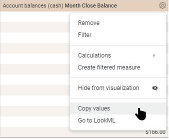
Removing fields
Remove a field from an Explore by clicking the field’s name in the Field-picker, or by clicking on the column's gear menu and selecting Remove.
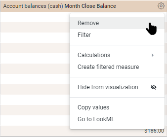
Reordering columns
Click on a column header and drag to reorder the column.
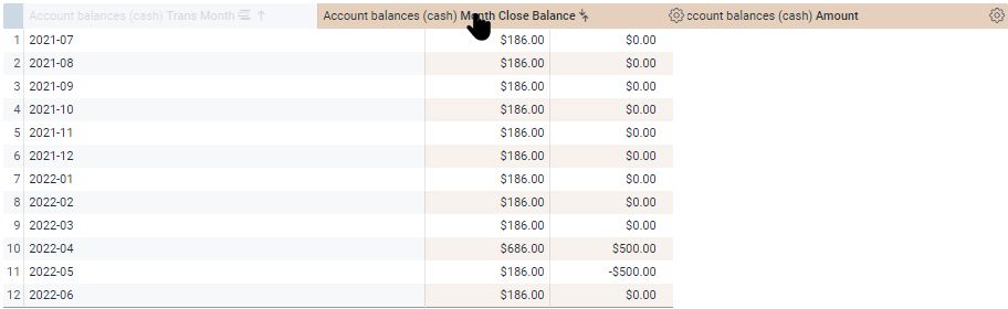
Columns under a pivoted dimension can be reordered, but the order of pivoted dimensions must be changed by changing the sort order.
When there is a pivot, the Row Totals can switch position by toggling the chevron between < and > .
Field-picker icons
The icons next to each field in the Field-picker are:
Pivot

Click to pivot or unpivot a field in an Explore. This icon will appear bold when a field is pivoted. This icon was discussed in Working with Explores - Adding a Pivot.
Filter
Click to add or remove a field as an Explore filter. This icon will appear bold when it is an active filter. This icon was discussed in Working with Explores - Adding Filters.
Info

Click to have some details about a field displayed.
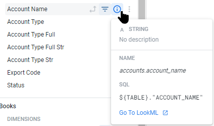
More

Click the More icon ( ⋮ ) to quickly and easily create Custom Fields (discussed below), or for Custom Fields, edit, duplicate or delete the Custom Field.
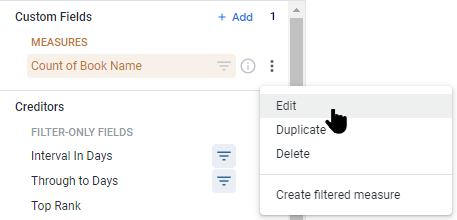
Field-picker Custom Fields
Custom Fields can be created from both Measures and Dimensions.
Measures can only be used to create a Filtered Measure, while Dimensions can be used to create Bins, Groups, and Aggregated fields.
Bins are used to separate the values of a selected numeric dimension into a custom set of number ranges, while Groups are used to bucket results of a selected dimension under custom labels.
The Aggregates are:
- Count distinct: Counts the number of distinct values for a selected dimension
- Sum: Adds the values of the selected Dimension
- Average: Averages the values of the selected Dimension
- Min: Finds the minimum value of the selected Dimension
- Max: Finds the maximum value of the selected Dimension
- Median: Finds the midpoint of the selected Dimension
- List of unique values: Creates a list of distinct values of the selected Dimension
Adding Custom Fields
The easiest way to create Custom Fields is using the More ( ⋮ ) icon in the Field-picker to Bin or Group the Dimension, or select the appropriate Aggregate.
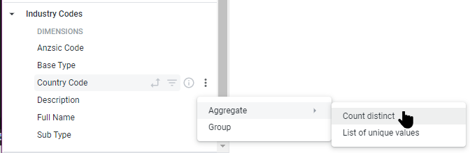
In the example above, selecting the distinct count of Country Code will create a new custom field giving the count of the number of countries represented in the data, as seen below.
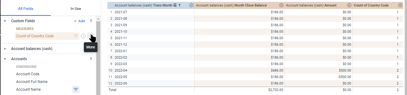
Editing Custom Fields
Click the More icon ( ⋮ ) of the Custom Field to be edited, and select Edit, this opens the edit dialog. Filters can be added to the Custom Field from the Filters tab.
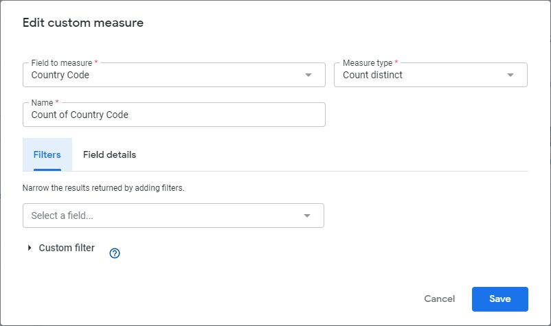
Make the changes required and click Save. Here, the name has been changed, then the Field details tab has been selected, and a description added. It is best practice to add a description.
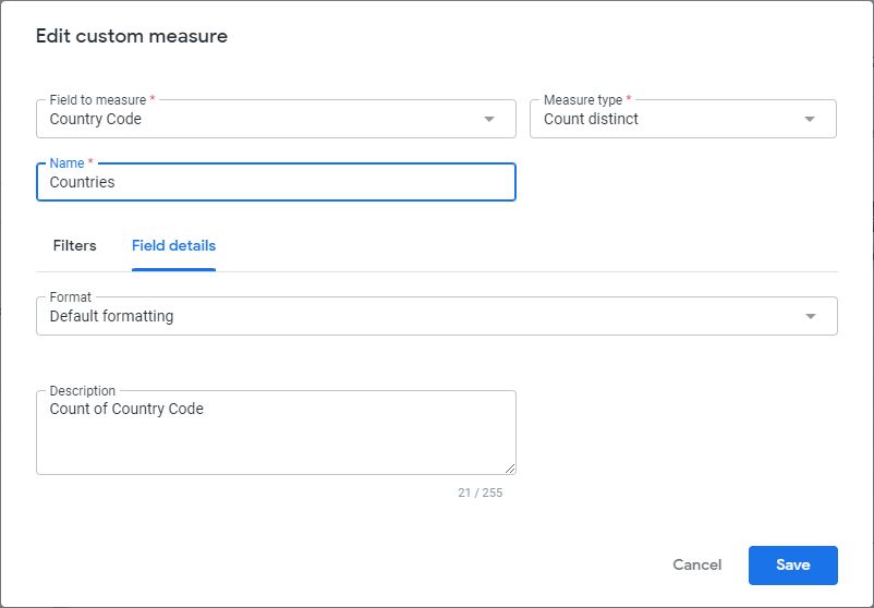
The Custom Field has been updated.
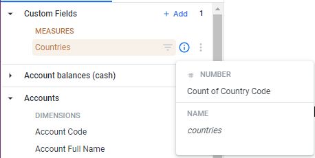
Duplicating Custom Fields
Click the More icon ( ⋮ ) of the Custom Field to be duplicated, and select Duplicate.
Duplicating and then editing a Custom Field can be useful to create multiple Custom Fields with minor differences, e.g.: 30-day, 60-day, 90-day sums.
Deleting Custom Fields
Click the More icon ( ⋮ ) of the Custom Field to be deleted, and select Delete.
Visualisation types
The Visualisation type selected determines how the data series is displayed. There is plentiful information available online regarding chart selection, so a very quick guide is:
To compare values:
- Column
- Bar
- Line
- Scatterplot
To show proportion:
- Pie
- Stacked Bar
- Area
- Waterfall
To understand range and distribution:
- Scatter Plot
- Line
- Column
- Bar
To analyze trends:
- Line
- Dual-axis Line
- Column
To look for relationships:
- Scatterplot
- Line
The Visualisation types available in Reckon Insights are:
Charts
Column
Bar
Scatterplot
Line
Area
Pie
Donut Multiples
Funnel
Timeline
Waterfall
Text and Tables
Single Value
Single Record
Table
Table (Legacy)
Table Report
Table with subtotals
Wordcloud
Maps
Map
Static Map (Points)
Static Map (Regions)
Other Charts
Box Plot
Liquid Fill Gauge
Back to Table of Contents - Creator